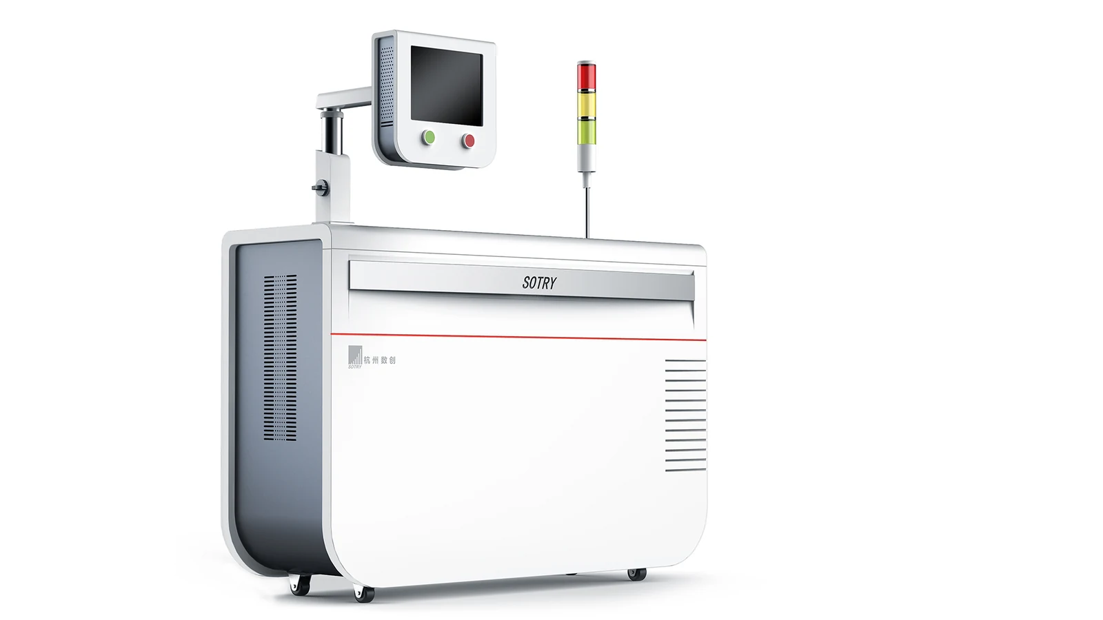
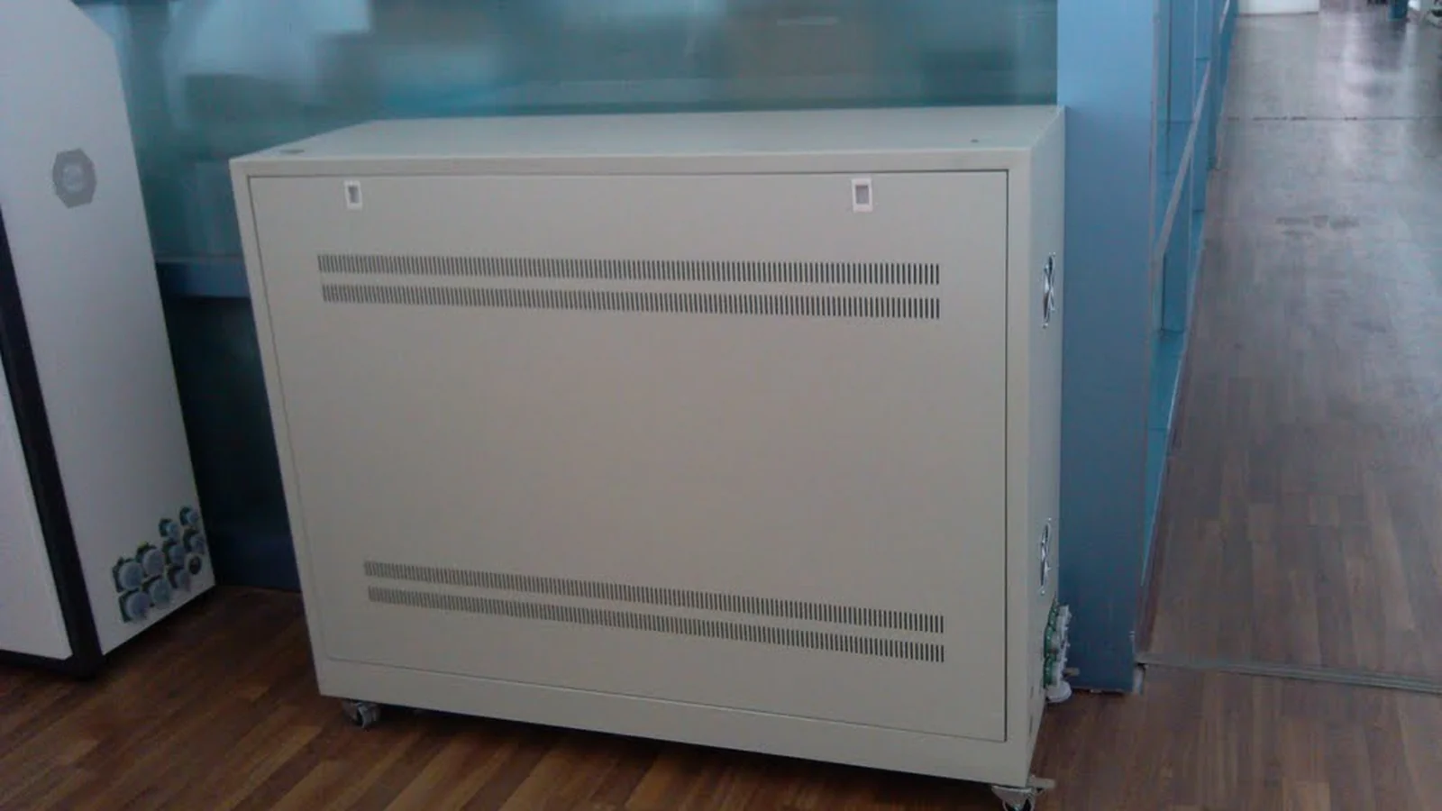
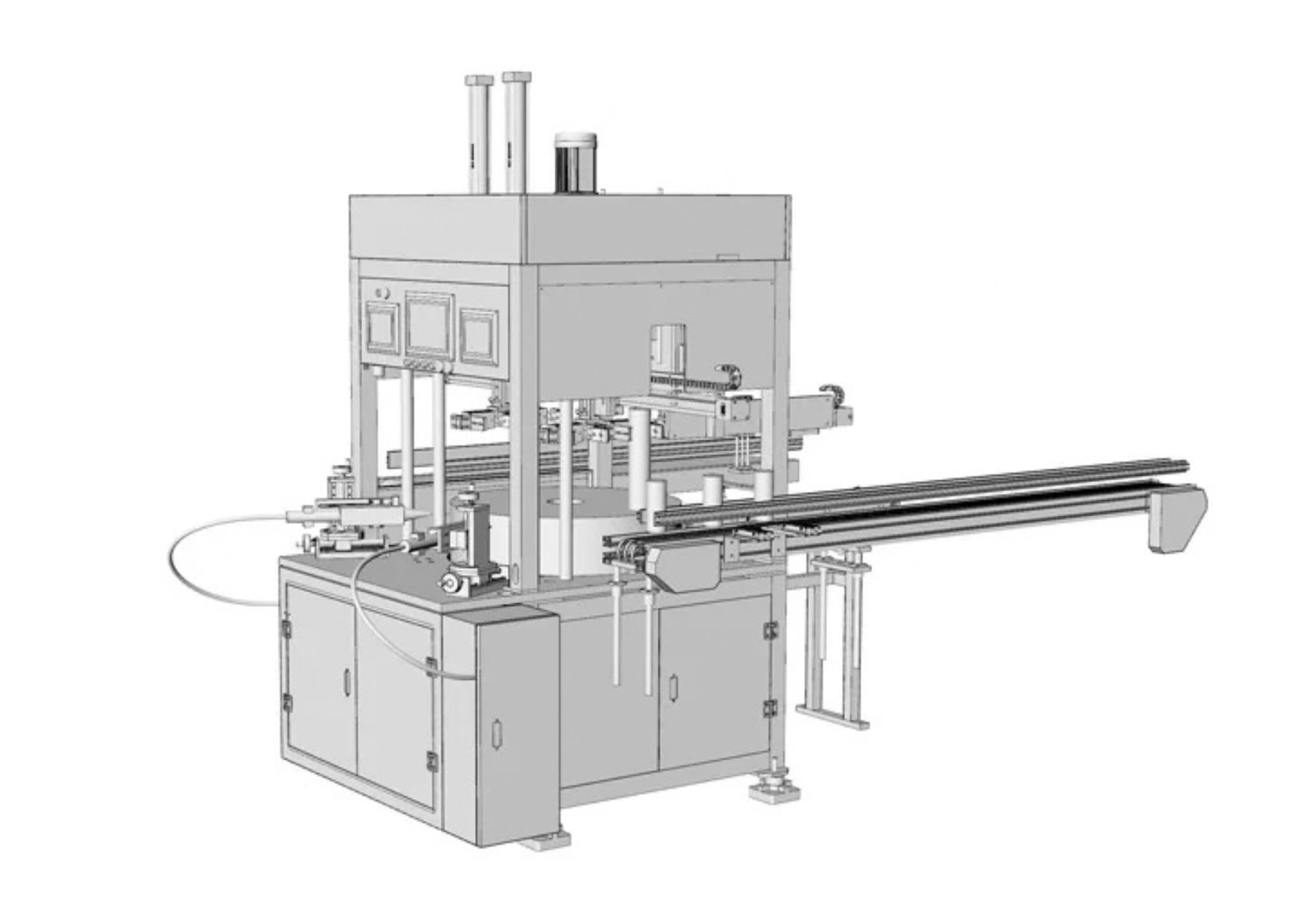
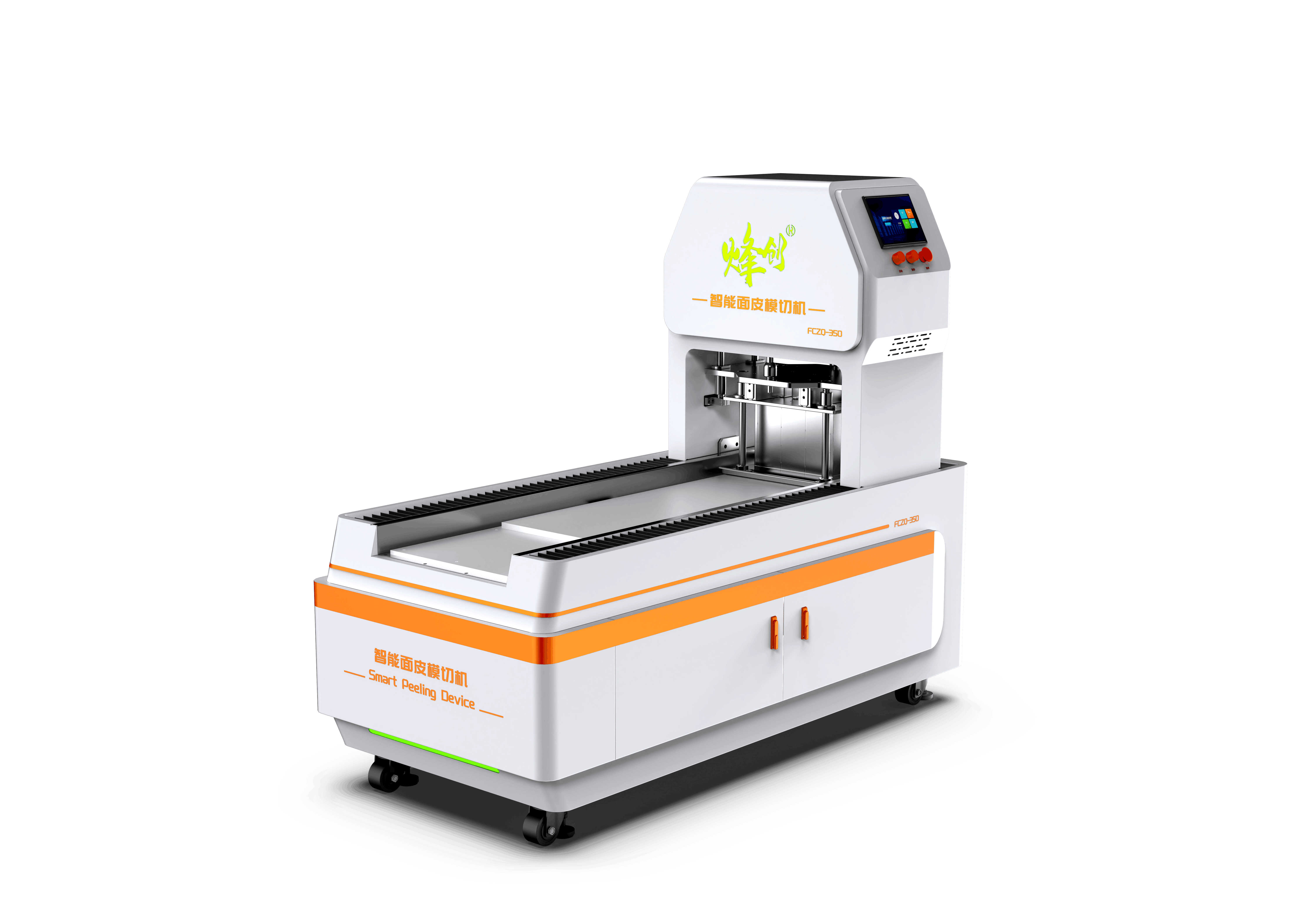
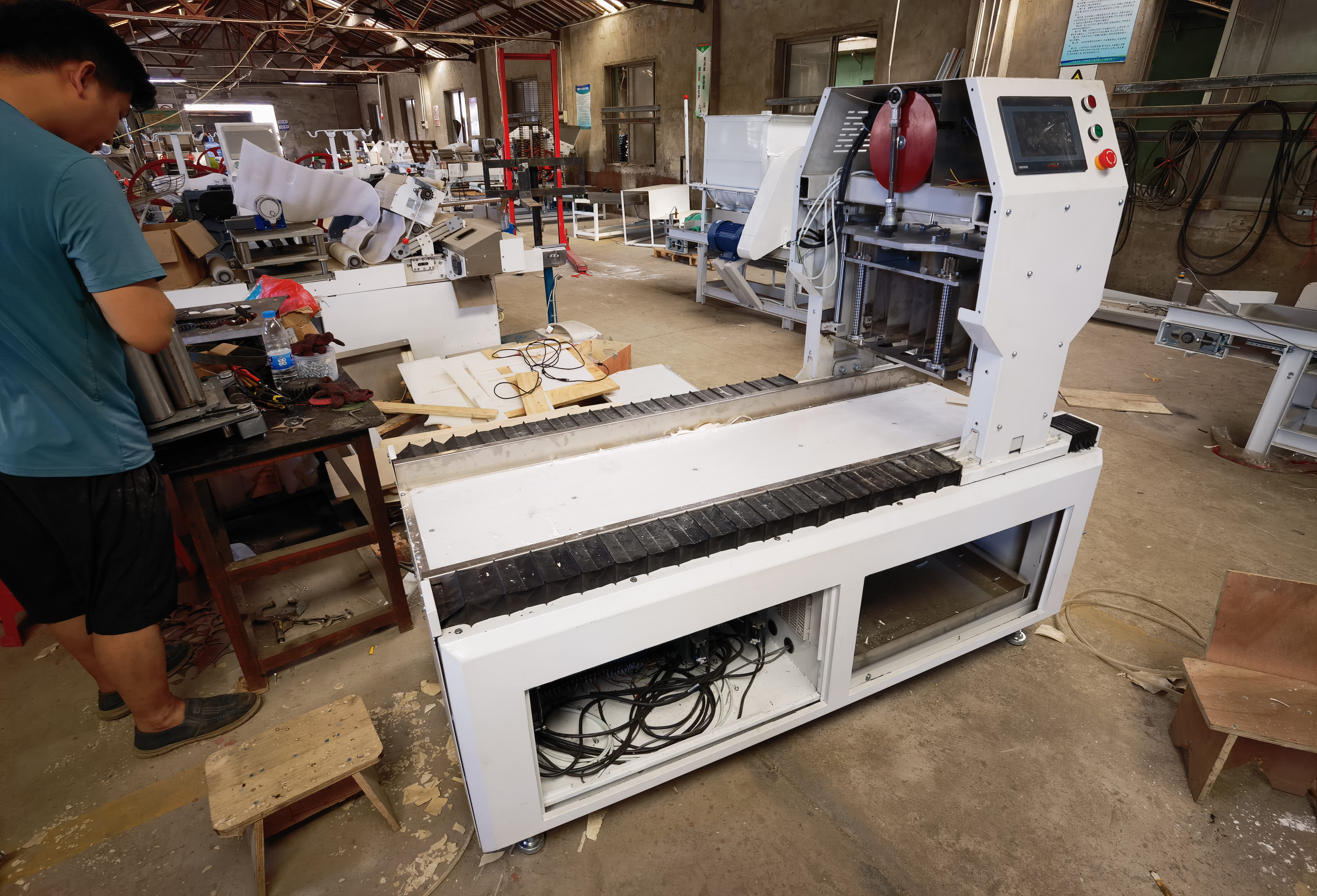
The client’s existing equipment presented several key design challenges:
1. Lack of Visual Order
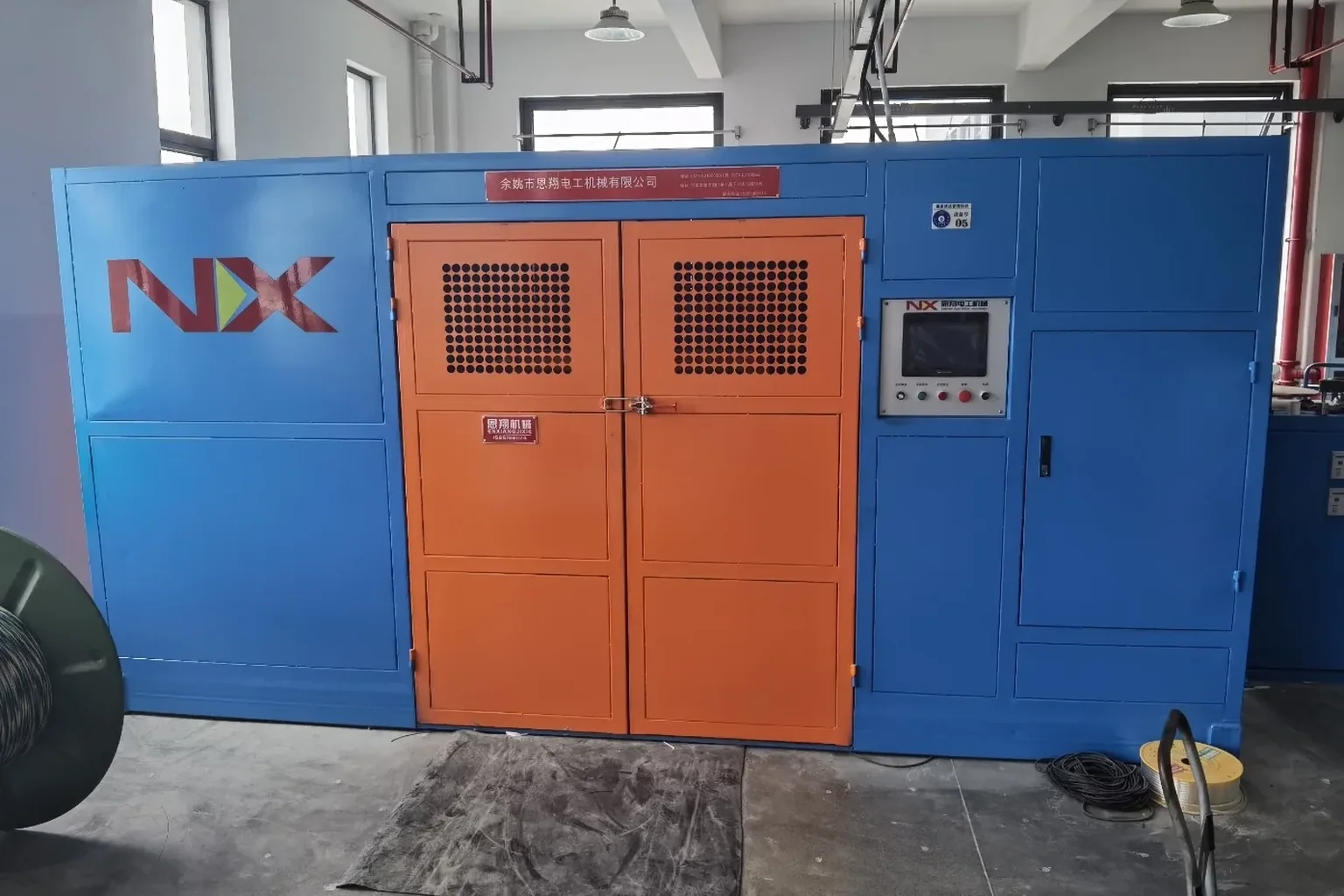
The main functional modules—including the support frame, machine body, and control cabinet—appeared as disconnected components assembled together. Without consistent lines, volumes, or visual transitions to connect them, the overall form felt fragmented and loosely organized, lacking a coherent design language.
2. Unstructured Color Scheme
The combination of a white support frame, red-and-gray machine body, and exposed metal components created a visually inconsistent appearance. There was no distinctive brand color to establish a unified identity, nor a well-balanced color ratio, resulting in an overall impression that felt rough and lacking refinement.
3. Unrefined Details
Exposed cables and piping, a basic control-panel interface, and untreated joints between equipment components revealed a lack of industrial design refinement. These details diminished the equipment’s sense of quality and professional craftsmanship.
4. No Visual Focus or Brand Identity
The brand identity was not integrated into the core form of the equipment, leaving no clear visual focal point. The overall appearance conveyed a sense of “functional components assembled together” rather than a deliberately designed industrial product. As a result, it lacked both visual hierarchy and the refined, professional character expected of a high-end equipment brand

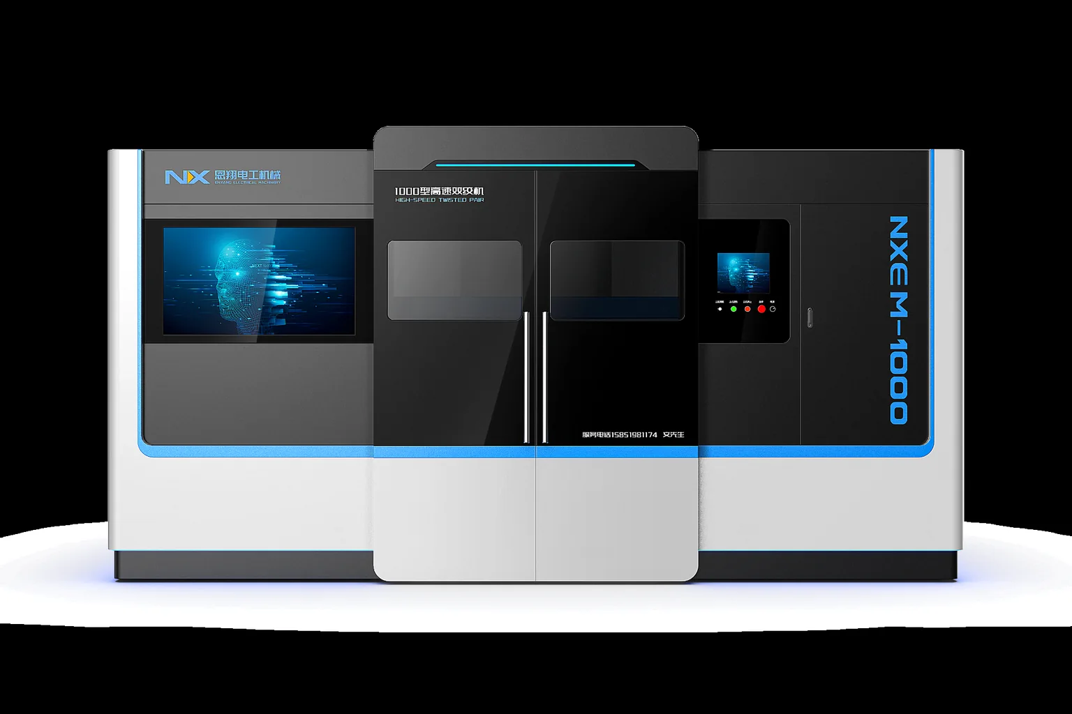
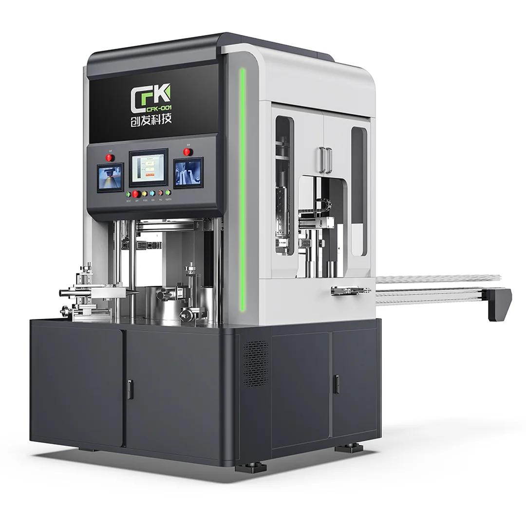
The Shuizhe Design team conducted a comprehensive visual redesign of the existing bellows production line, addressing its appearance challenges across four key dimensions: visual identity, branding, form, and detailing.
Centered around Integrated Form, Brand-Driven Color, Refined Detailing, and Focused Visual Hierarchy, the redesign elevates the equipment’s overall appearance to create a more cohesive industrial aesthetic with stronger visual order, brand recognition, and professional quality.
1. Form Integration
Connected the previously fragmented modules through unified volumes and continuous lines, establishing a more structured and harmonious visual order.
2. Color System
Developed a dedicated brand color system and unified the primary color palette. Exposed components were visually enclosed to create a cleaner appearance and strengthen brand recognition.
3. Detail Refinement
Concealed exposed piping and cables while refining joints, control panels, and other key details. Carefully selected materials and finishes further enhanced the overall sense of quality.
4. Brand Integration
Integrated brand elements into key visual areas of the equipment, creating distinctive focal points and achieving a deeper connection between product design and brand identity.
Through a comprehensive appearance upgrade, the equipment evolved from a “functional engineering machine” into a product driven by both aesthetics and brand identity, enhancing its market competitiveness while creating greater potential for brand value and product premium.
1. Visual Impact
Established a more structured and harmonious industrial aesthetic, eliminating the previous sense of visual clutter.
2. Brand Impact
Strengthened visual brand recognition, transforming the equipment into a mobile brand statement wherever it operates.
3. Market Competitiveness
Enhanced the product’s visual appeal and differentiation, helping it stand out in a competitive market.
4. Product Value
Improved the overall visual and operational experience while creating greater opportunities for product differentiation and premium positioning.