CASE STUDY
A conventional production-line control cabinet is redesigned with a clearer operator interface, integrated ventilation zones and a more coherent industrial product language.
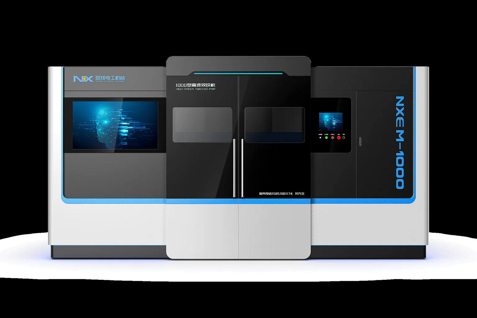
This project focused on redesigning a production-line control cabinet, turning a conventional sheet-metal electrical enclosure into a more integrated equipment unit with clearer product identity and operator-facing organization.
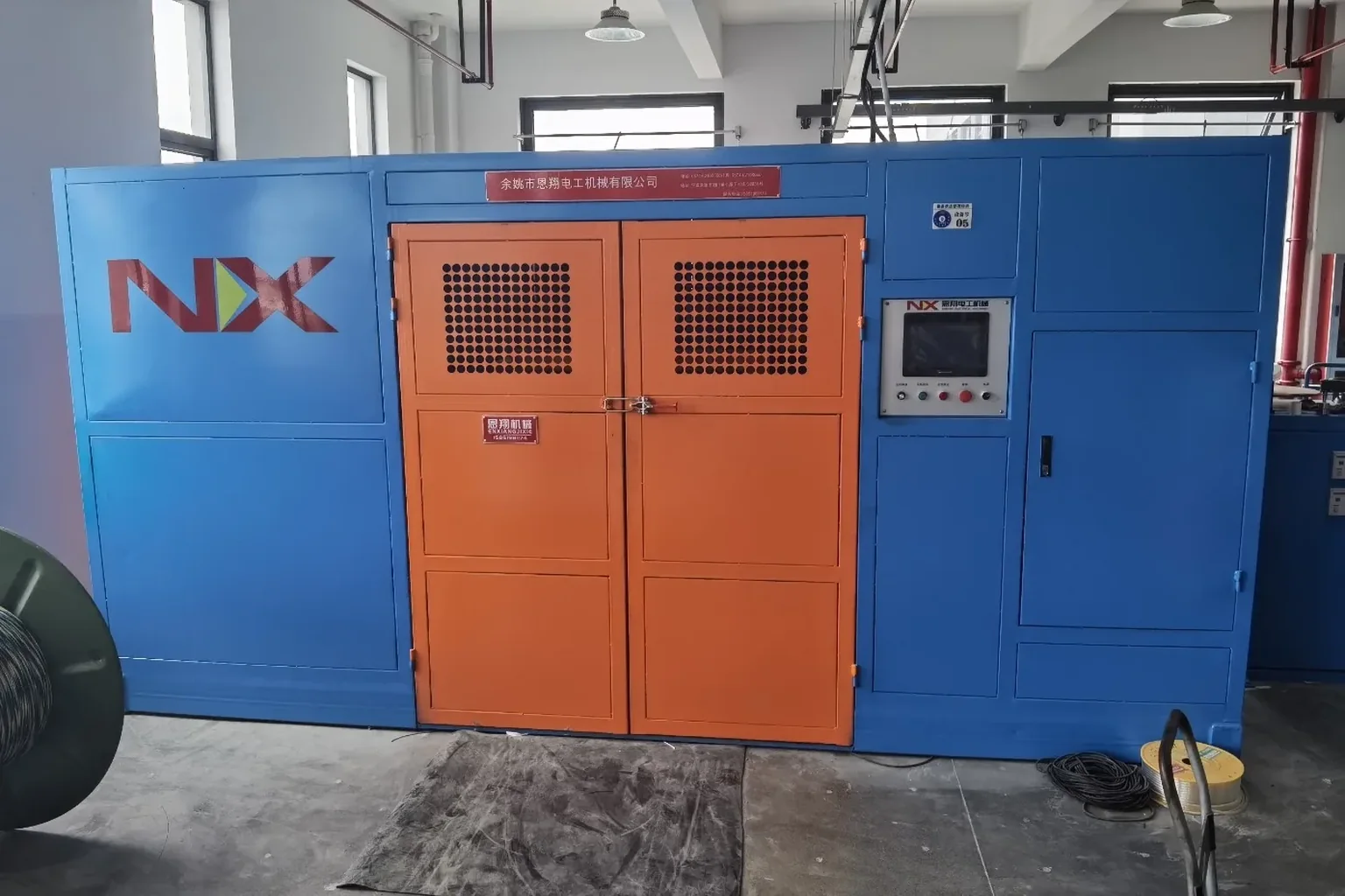
The original cabinet followed a conventional rectangular enclosure approach, with large flat panels, exposed ventilation slots and casters. The redesign reorganized the cabinet body, display unit, physical controls, status tower, ventilation and brand graphics into a more coherent product architecture.
Control cabinets are often treated as supporting engineering components rather than as part of the product experience. On an automated production line, however, the cabinet can also be an important visual and operational interface between people and equipment.
The design challenge was therefore not simply to restyle a box, but to give the control cabinet a clearer relationship between enclosure, operation, status indication and product identity.
The redesign combines functional integration with visual simplification. Large light-colored surfaces establish the main body, while a darker side zone adds depth and visually organizes the ventilation area.
Softened outer corners reduce the rigid appearance of a conventional sheet-metal cabinet. A thin red horizontal line creates a controlled visual accent across the front, while the display and physical controls are raised above the cabinet body as a distinct operator-facing module.
The result is a cabinet concept in which the enclosure, interaction area, ventilation, status indication and brand graphics are treated as parts of one product rather than as separate engineering additions.
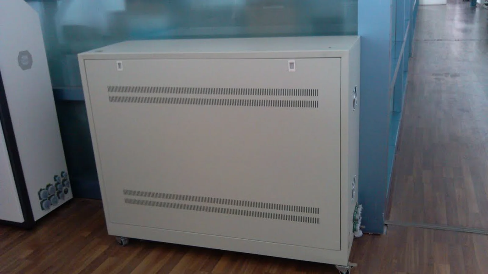
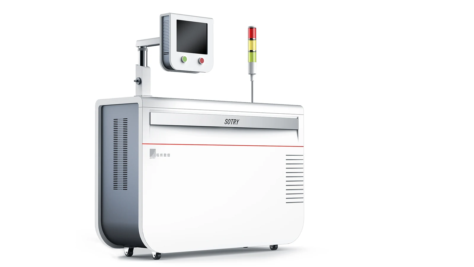
The original cabinet was visually dominated by a rectangular sheet-metal enclosure and long exposed ventilation bands. In the redesign, the body is given a more defined front, side and edge relationship, creating a clearer overall silhouette.
Rounded outer transitions and the darker recessed side area reduce the impression of a standard electrical enclosure and give the cabinet a more complete industrial-product character.
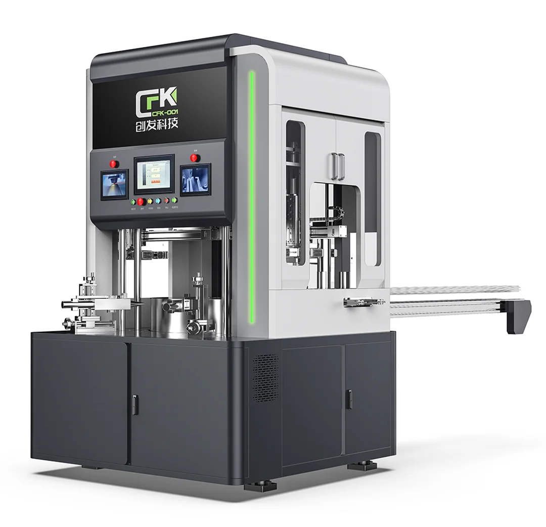
The design places the operator display above the main cabinet body on a dedicated support structure. This creates a clear visual distinction between the enclosure and the interaction area while keeping the screen immediately identifiable.
Physical green and red controls are integrated directly below the display, concentrating the primary operator touchpoints into one compact module.
A tower signal light is integrated into the upper area of the cabinet design. Its elevated position makes the status indicator easy to notice from around the equipment and visually connects machine-state information with the operator interface.
The available project material confirms the presence of the status tower, but does not establish a specific color-to-status logic, so the design is presented here without assigning unverified meanings to individual colors.
Ventilation openings remain clearly visible because they are functional requirements, but their form and position are integrated into the overall composition rather than treated as isolated perforations.
Vertical slots on the dark side panel and horizontal openings on the front create different functional zones while maintaining a consistent visual order.
The CMF strategy uses a restrained combination of white, dark gray and a thin red accent line. The light main body creates a clean base, while the darker side area emphasizes depth and functional differentiation.
Brand graphics are positioned within defined areas of the front surface, giving the cabinet a more unified branded appearance without relying on excessive decorative elements.
The redesign reframes a conventional production-line control cabinet as a more complete industrial product concept. The screen, physical controls, signal tower, ventilation and brand graphics are visually coordinated instead of appearing as separate additions.
The project demonstrates how even a relatively compact piece of production-line equipment can use industrial design to create clearer product order, a more coherent operator-facing interface and stronger visual identity.