CASE STUDY
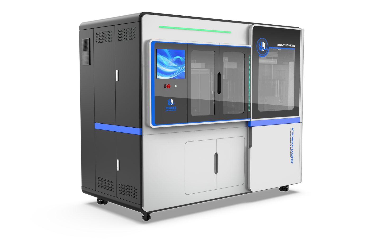
Exterior design for a lead shielding room of an intelligent industrial CT inspection system: a silver-grey shield volume with continuous folded planes, a white door array framed in red, a green status band and a control tower with an E-stop — protection turned into a visible, readable color language.
A lead room is a silent device: all of its work happens behind the walls, where invisible radiation is quietly kept. Its exterior design therefore relies not on decoration, but on turning "protection" into a visible, readable language — this design started from four questions that had to be answered.
This lead room is the shielding core of an intelligent industrial CT inspection system built by a measurement-and-control technology company. The project focuses on the exterior design of the sheet-metal enclosure. Silver-grey, white, red and green each have a job to do: grey is the shield, white is the door, red is the boundary and warning, green is the status — every color answers one question.
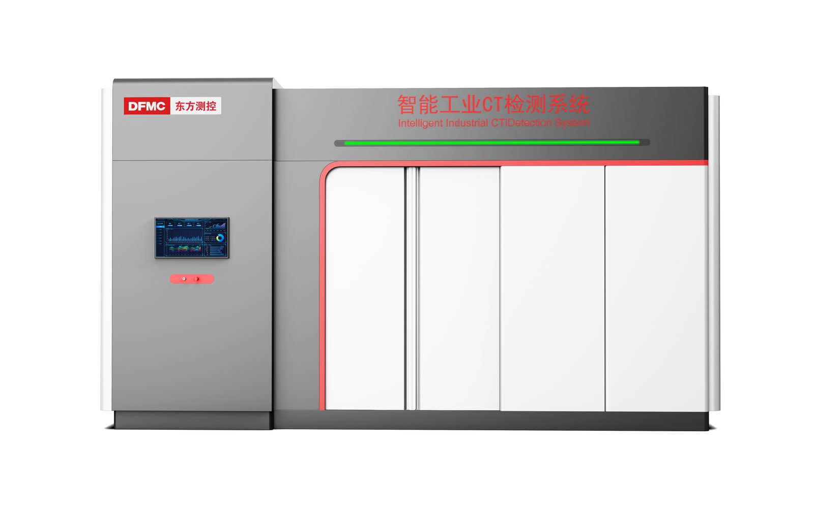
The first thing the exterior must communicate is "airtight". The large silver-grey shielding planes carry almost no decorative openings: broad folded sheet-metal surfaces run continuously, seams are minimized and follow only the structural zoning of the shield. A dark-grey base lifts and steadies the whole room, and a dark-grey cornice closes the top line — three clean layers with no redundant bumps or recesses. This restraint is not conservatism; it is the visual promise of shielding integrity: a wall is a wall, without interruptions or exceptions.

The entrance is designed as a full-face array of white doors, clearly separated from the grey walls by material and color — no one has to search for the door; the door steps forward on its own. Each door is framed by a red outline: not decoration, but a drawn boundary indicating that beyond the frame lies the area outside protection. Seams are even and handles vertically centered — large sheet-metal planes live or die by seam alignment and flatness, and this door array puts "precision" into details the eye can verify.

Radiation is invisible, so status must be translated into visible signals. A green light band runs along the top of the door frame — the most direct "running" indicator when the system works; a three-color beacon on the roof raises the status to a height readable from a distance; on the left control tower, a blue screen handles parameter interaction while a red E-stop sits alone within easy reach. Safety is the baseline of usability — convenience must never offset the loss of safety conditions. This lead room places warnings and the E-stop at their most visible, most natural positions, accepting a touch of extra prominence over any chance of a misread state.

Above the dark-grey cornice, a red brand title runs across the front, and the system name is set vertically on the side tower — the large silver-grey and white surfaces make these two spots natural focal points. Brand recognition here does not come from labels everywhere, but from expression concentrated at the two highest positions: from afar, one red line of text on the cornice and one red frame around the door are enough; up close, the vertical text on the tower and the screen on the control tower finish the story. The identity order stands on three elements: one title zone, one door-frame line, one status band — nothing else competes for attention.
For the operator, this lead room explains itself without a manual: the grey wall says do not open, the white door says enter here, red means boundary, green means you may work. When protection is translated into colors and positions that can be read at a glance, safety is no longer the lead inside the walls — it is a language everyone standing in front of the machine understands.
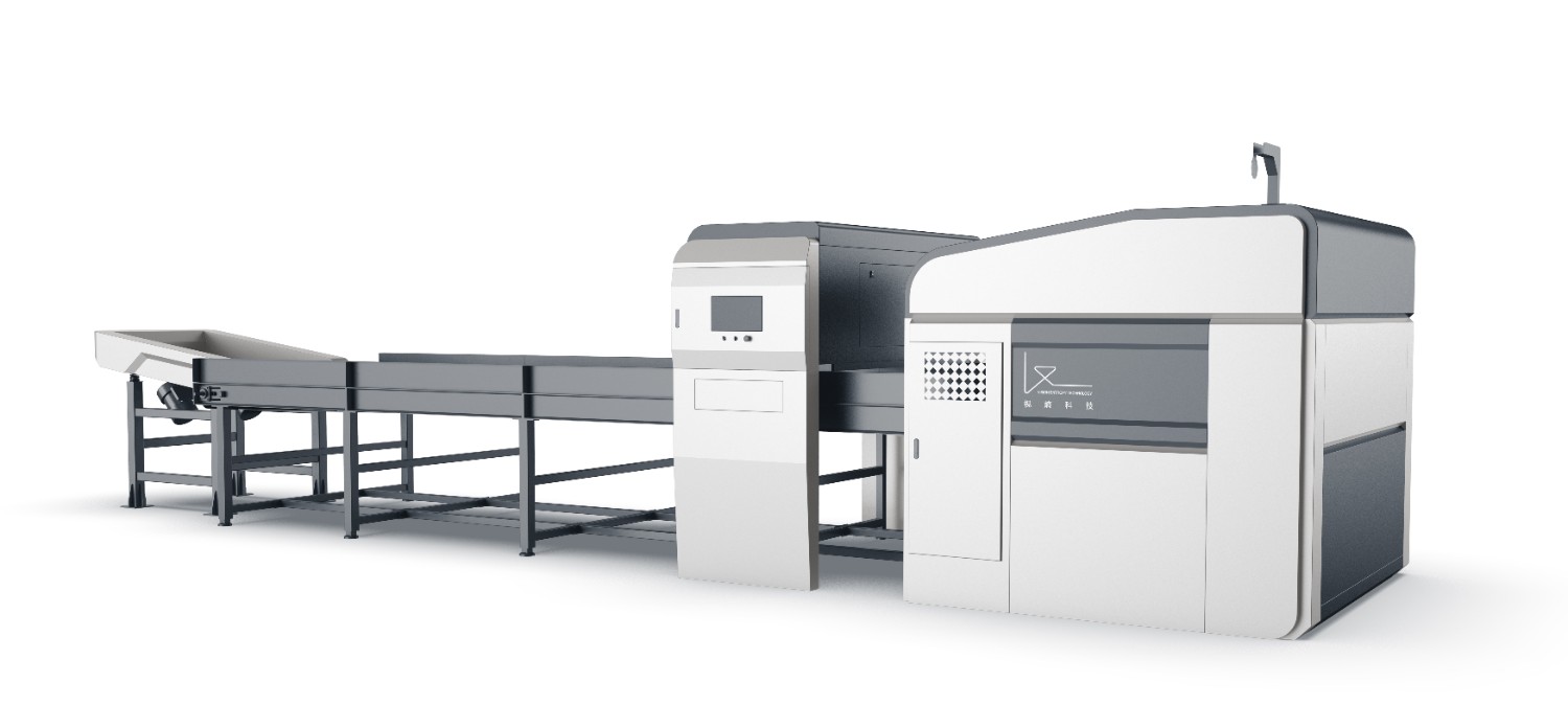
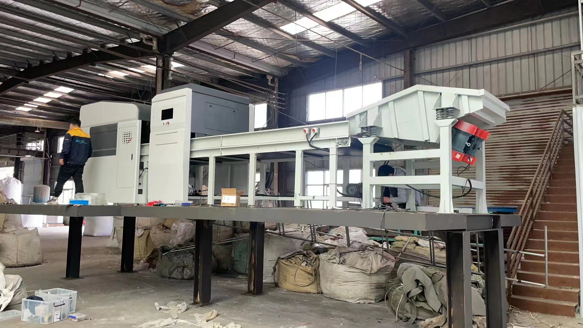
By optimizing the product structure, visual identity, functional organization, and interaction experience, the redesign enhances product recognition, perceived quality, and brand expression while maintaining engineering practicality.
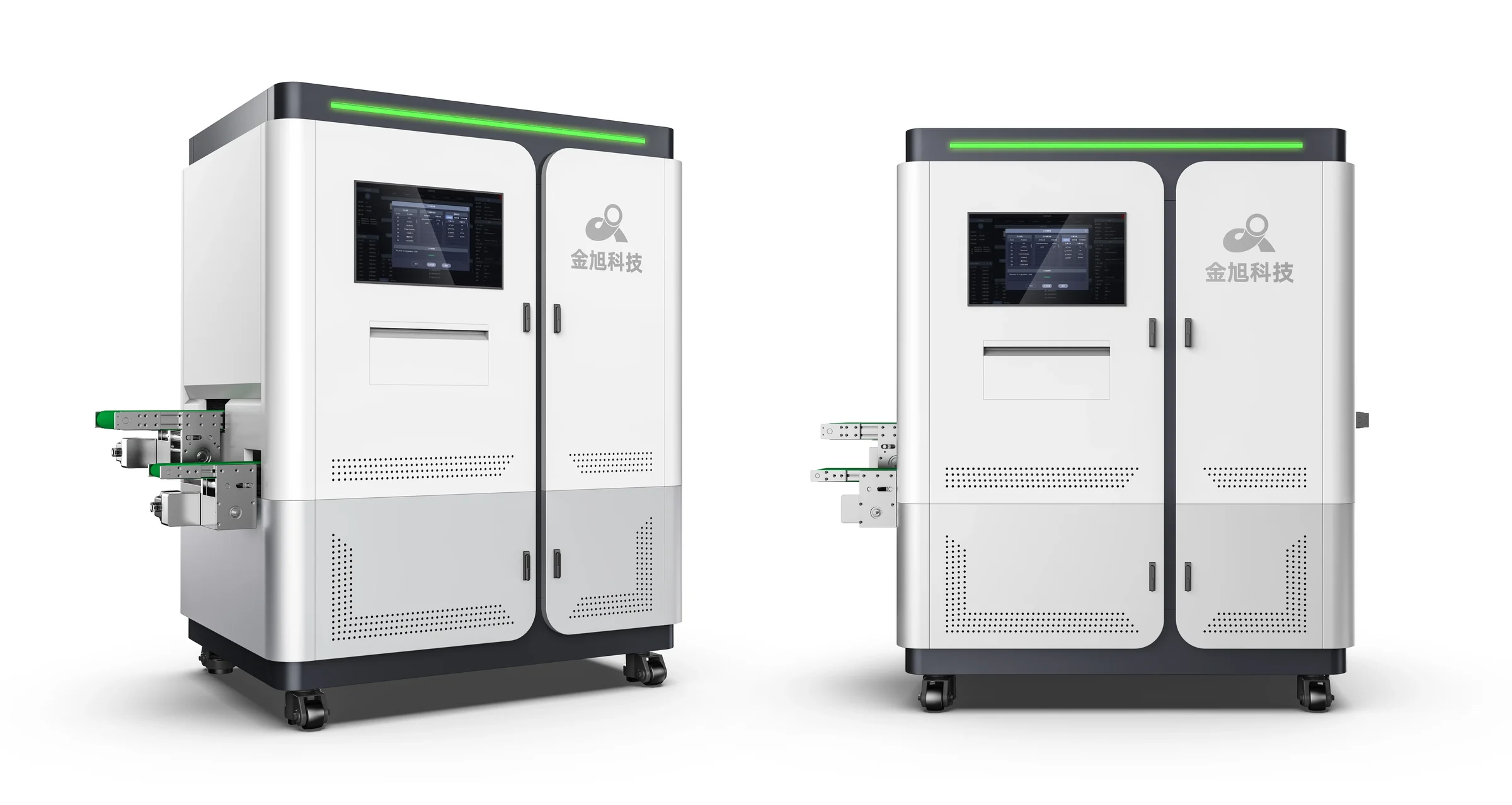
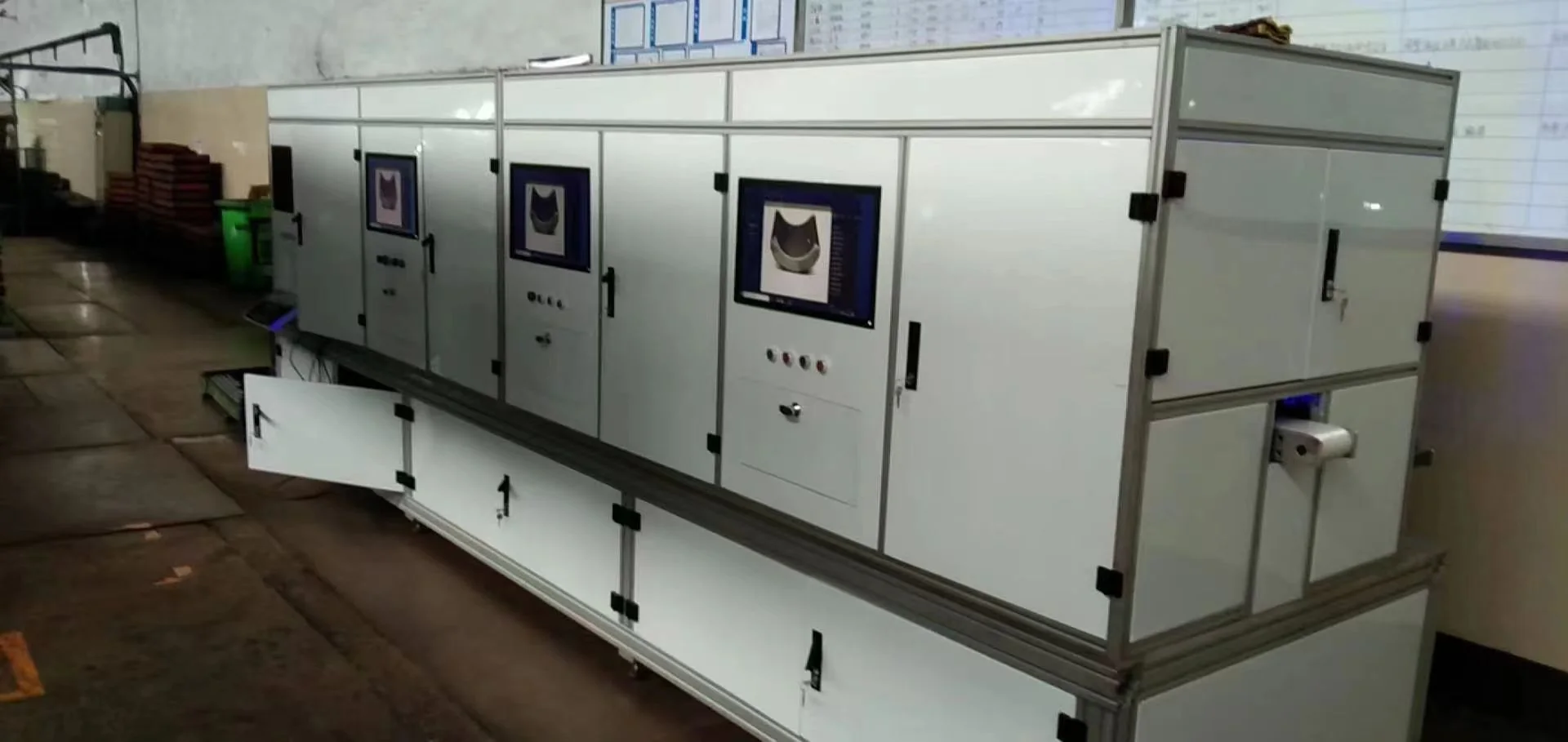
EQPID transformed an engineering-led inspection machine into a more integrated industrial product by reorganizing its overall proportion, functional zones, operator interface, CMF and sheet-metal enclosure architecture.

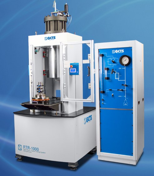
EQPID redesigned a regular triaxial mechanical testing system, transforming an exposed engineering instrument into a tower-form laboratory product with an integrated safety enclosure, observation window, clear brand identity and a flexible CMF system.