CASE STUDY
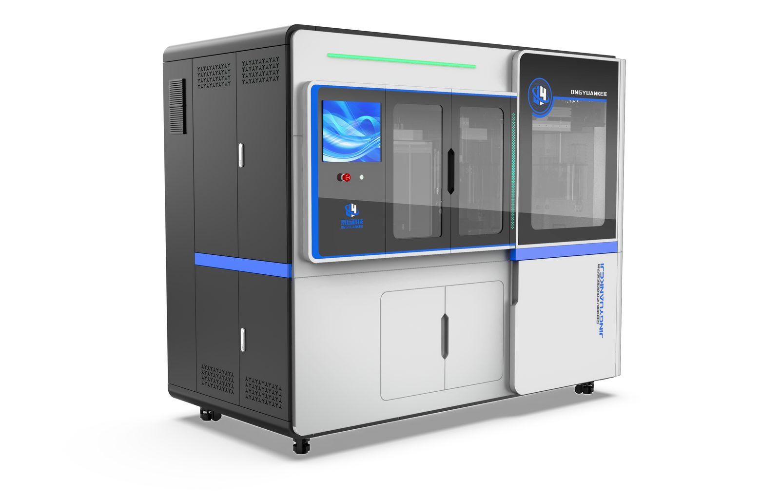
Two CMF directions on one shared structure for the GPX Steel-A automatic ferrous sample milling machine: a quiet laboratory-white scheme and a charcoal-and-red main scheme, balancing brand recognition with site adaptation.

In a metallographic lab, the milling machine is the first stop of every sample journey: it machines a cut metal specimen into a flat, analysis-ready surface before spectrometers and microscopes take over. The GPX Steel-A automatic ferrous sample milling machine, designed for an equipment manufacturer in East China, performs exactly this task - and its predecessor, like most sample-preparation machines, was a purely functional sheet-metal box.
For this exterior design project, we developed two CMF directions on one shared structure. Form, mechanism and ergonomics stay identical; only the color, material and finish vocabulary changes - because the character of an industrial machine is often decided at precisely this layer.
Both directions share the same three-part vertical architecture: a top shell enclosing dust extraction and drive components, a middle working chamber with an observation window, and a base carrying electrics and swarf collection. Generous corner radii run through every edge, so the body reads as one continuous volume from any angle.
The visual weight is deliberately placed in the upper body for stability, while the operator terminal cantilevers out from the side, leaving a breath of space between screen and chassis. With the structure fixed, everything else is handed over to CMF.
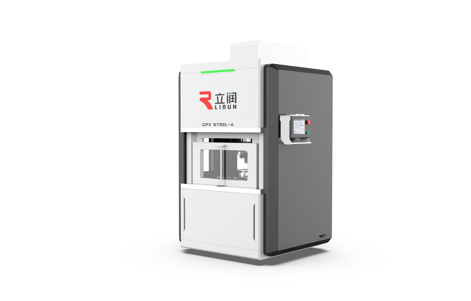
The first direction speaks to inspection laboratories: a large white main body blends into clean interior light, dark grey side wings wrap around like a work apron, and a green status strip on top reports the running state from across the room.
The touch terminal hangs on a white swing arm, and the screen UI stays in the same colour family as the body. The whole scheme is quiet, light and unobtrusive - the machine behaves like an instrument.
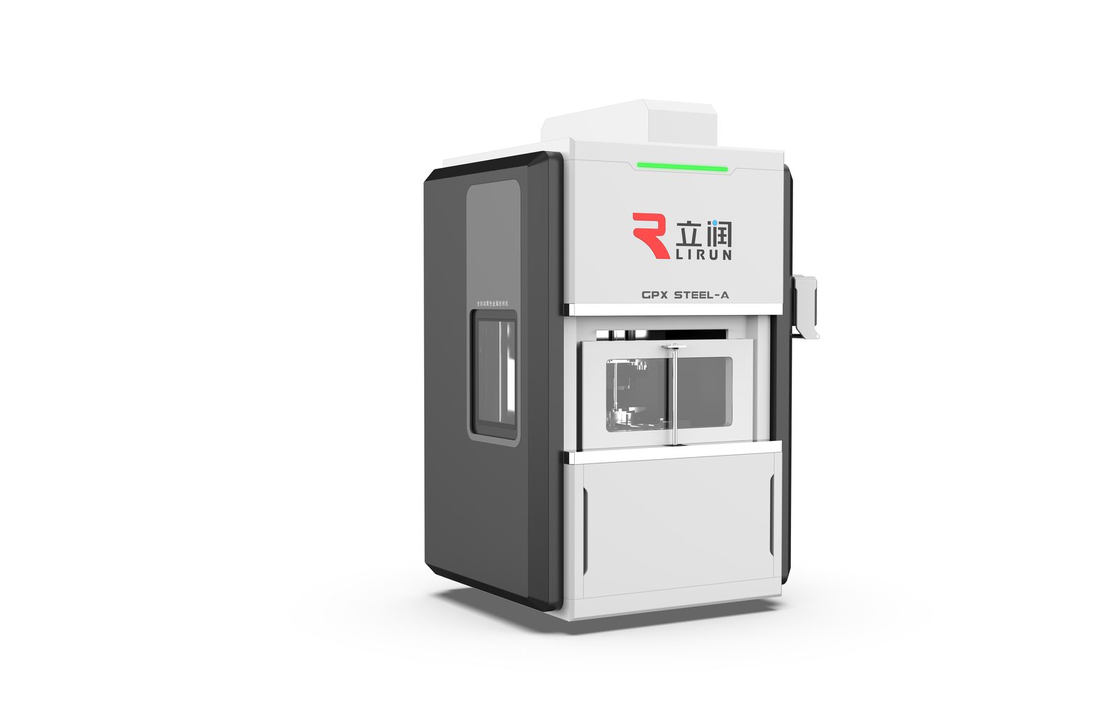
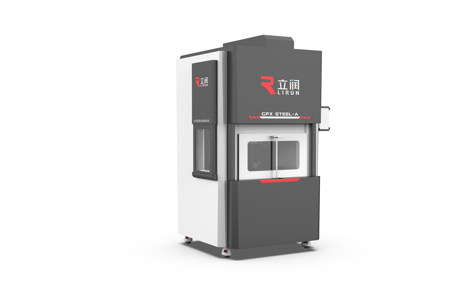
The second direction goes the other way: a charcoal shell sits heavily on the white body, the weight distribution readable at a glance, while a red band crosses the model-designation area in the same colour as the brand mark. Dark grey panels gather the observation window and controls into one colour field, leaving the front face with three levels: white, grey, one line of red.
If the light scheme says that it blends in, the main scheme says that you will not mistake it. It reads as a piece of equipment - identifiable even across a row of machines on the shop floor.
Higher-level far-view recognition should not rely on explicit logos alone, but on a product language that forms the brand impression by itself.
There is no winner between the two directions - only context. In a laboratory-dominant environment the light scheme fits in; where the floor is mixed and brand recognition matters, charcoal plus red takes a stance. Mature industrial design finds the balance between a company brand expression and the customer site conditions - and CMF is exactly where that balance becomes visible.
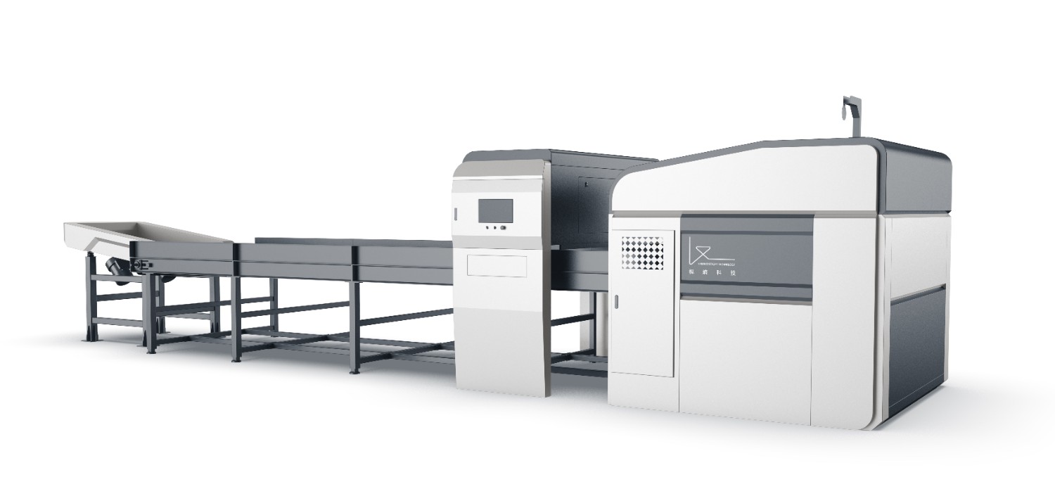
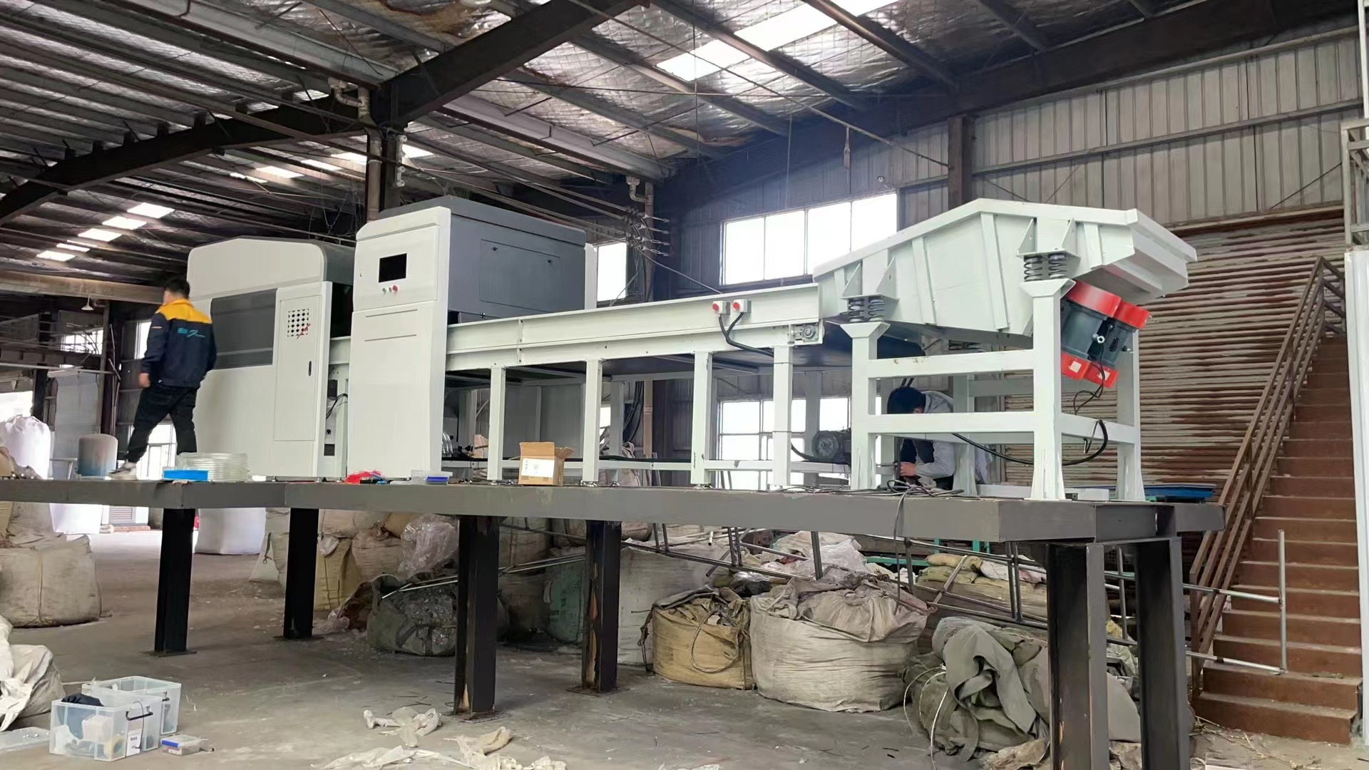
By optimizing the product structure, visual identity, functional organization, and interaction experience, the redesign enhances product recognition, perceived quality, and brand expression while maintaining engineering practicality.
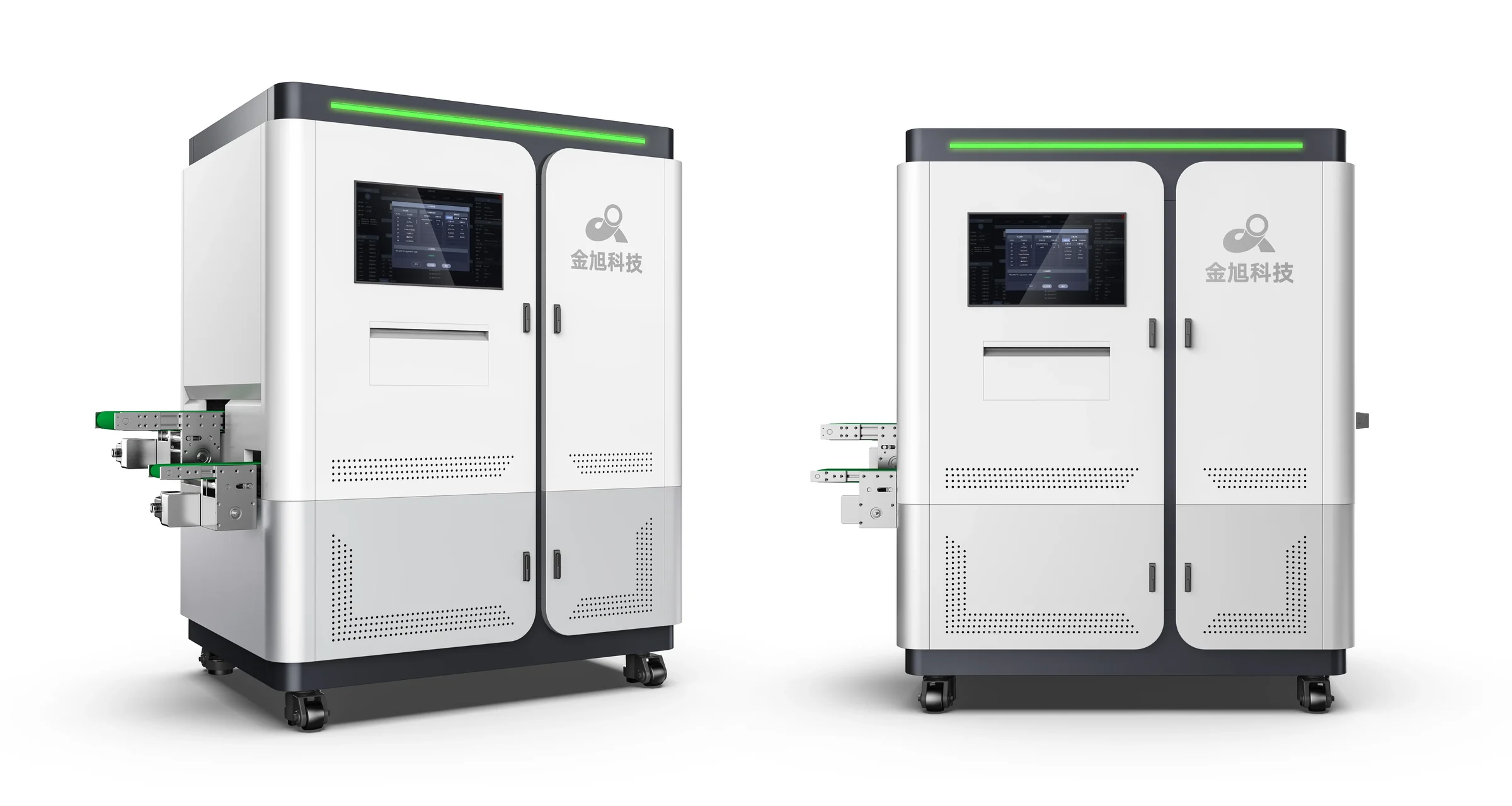
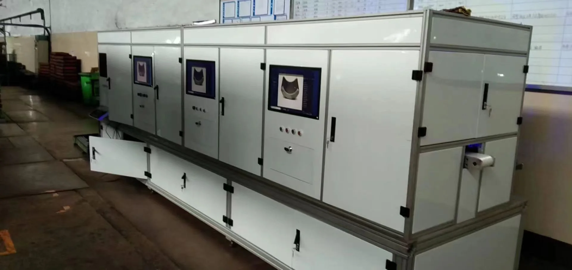
EQPID transformed an engineering-led inspection machine into a more integrated industrial product by reorganizing its overall proportion, functional zones, operator interface, CMF and sheet-metal enclosure architecture.

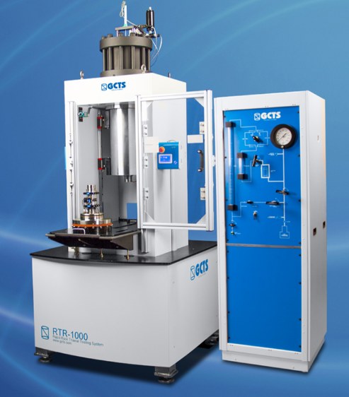
EQPID redesigned a regular triaxial mechanical testing system, transforming an exposed engineering instrument into a tower-form laboratory product with an integrated safety enclosure, observation window, clear brand identity and a flexible CMF system.

An exposed engineering mechanism enclosed as a clean laboratory instrument: zoned layout, visible process windows and a single blue thread across the body.


Exterior upgrade for the tube combustion furnace of a carbon-sulfur analyzer: an annular heat-dissipation ring on top, a cantilevered tilted touchscreen, and a charcoal functional bay on the front face — three details that make the machine look like the instrument it is.