CASE STUDY
Before-and-after exterior redesign for a circle cutting machine: a black top cap, a clean white body, and one orange accent line that ties the observation window, touchscreen and beacon into a single visual line — an upgrade from a generic white enclosure to a machine with a face of its own.
Every workshop has machines that could belong to anyone — a generic white shell that gets the job done but is forgotten by the end of the shift. A circle cutting machine built by a smart-equipment manufacturer used to be exactly that: white sheet metal, a blue acrylic observation window, a control box hanging off the side. Everything worked; nothing was remembered. This case is told in two lines at once — what the machine was, and what it became — without detours.
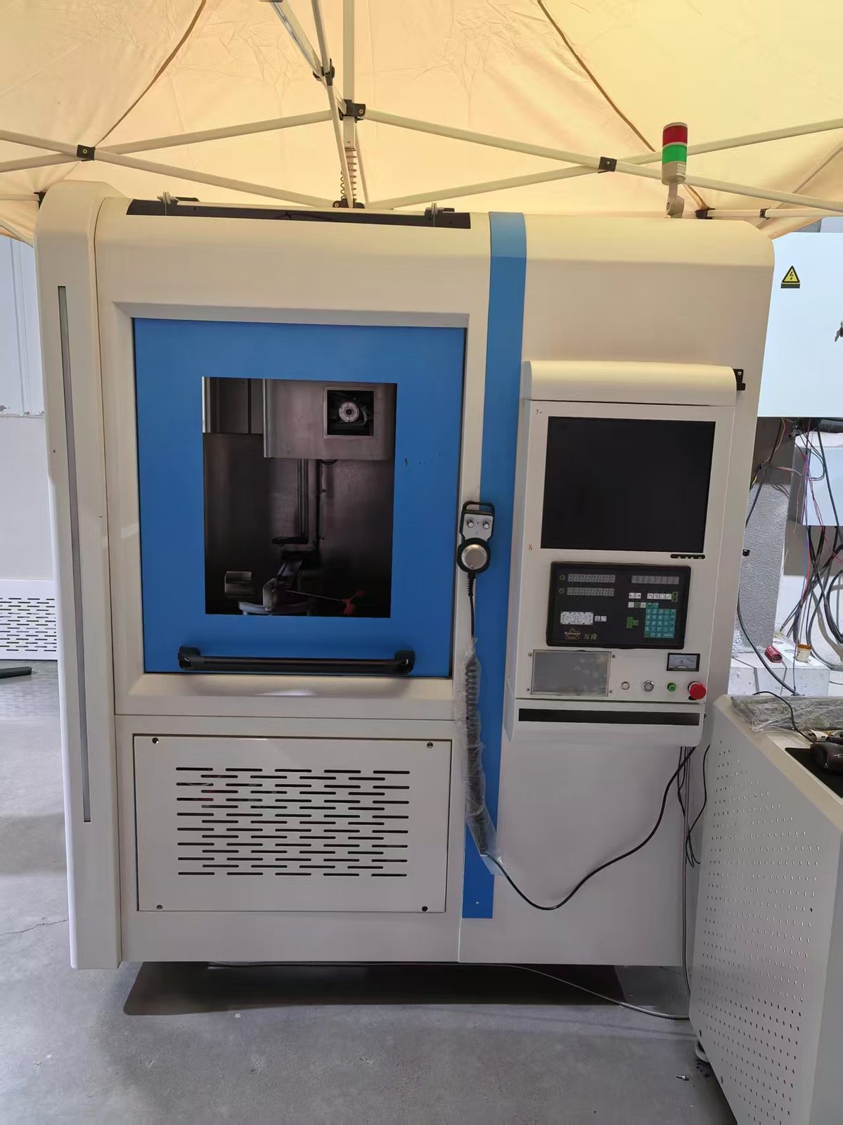
The original body wore the most common palette in the machining workshop: white sheet metal, a blue window, a blue stripe down the middle. It was not ugly — it simply owned nothing. Swap the shell onto another machine and it would still stand there, believable.
The redesign gave the machine a language of its own: a black top cap sets the visual weight, the white body reads clean and deliberate, and one orange accent line runs from the front face around to the side, tying the observation window, the touchscreen and the beacon into a single visual line. From a distance, the silhouette is steady and the color band is unmistakable — for the first time, the machine has a face people can recognize.
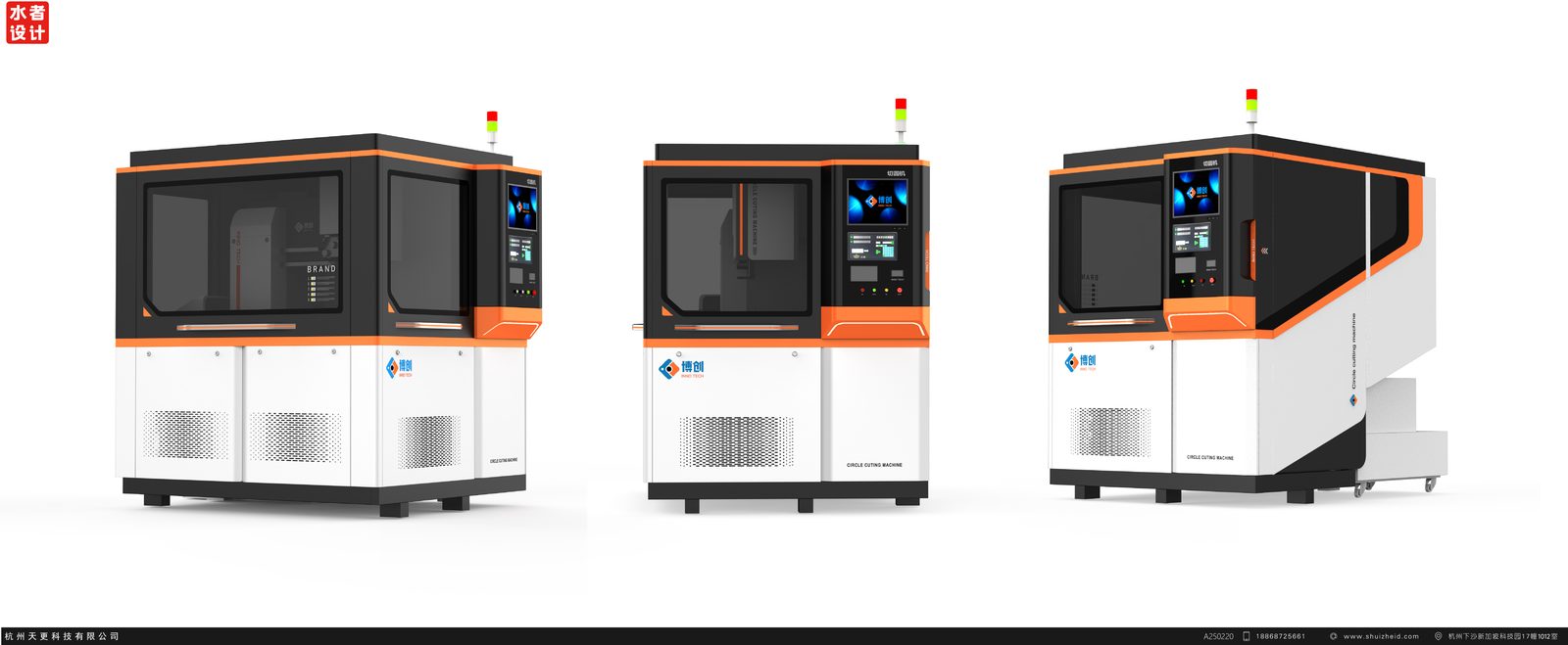
The orange line did not arrive in one stroke. In the first round it floated on the surface of the panels, and every corner of the top cap was rounded. In the final version the line settles into the seam between the top cap and the body, corners turn with the structure, and soft arcs give way to crisp chamfers — the accent becomes part of the form, not a sticker on it.
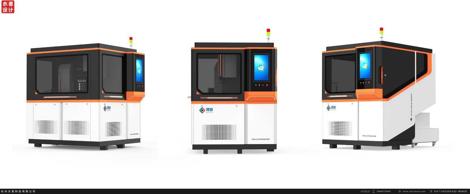
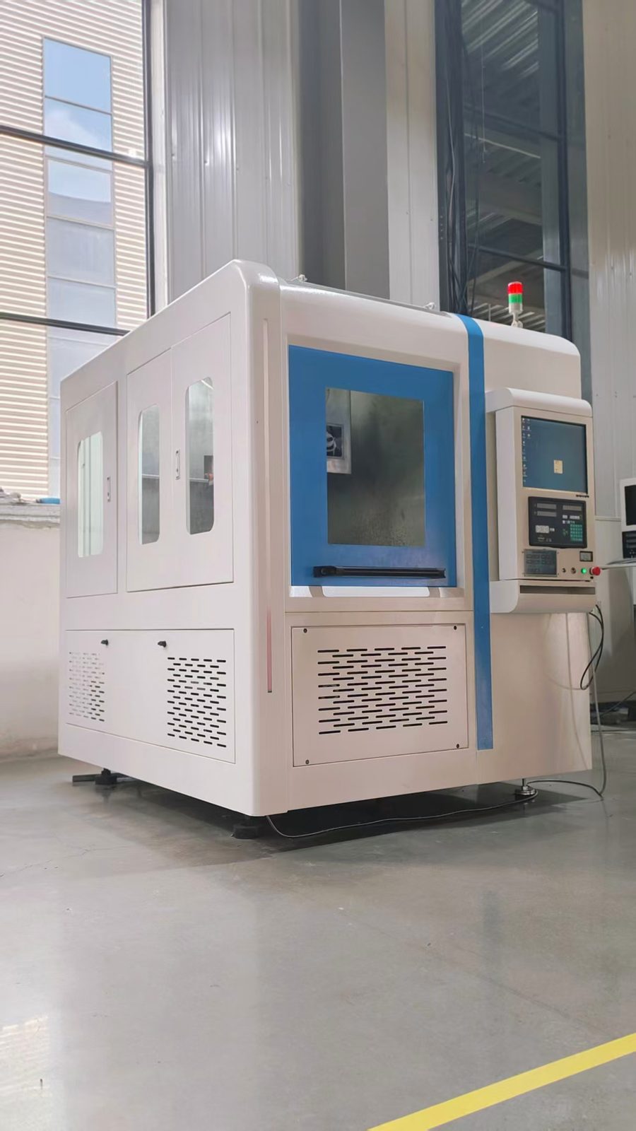
Before, operation lived in a separate control box bolted to the right side of the body: buttons, screen and emergency stop each doing their own thing, cables trailing down the frame. The functions were all there, but the operator and the machine were kept one step apart.
After, the touchscreen moves into the upper-right of the front face, sharing the same operating surface as the observation window: stand in front of the machine, watch the cutting state through the window, glance up to read the parameters — no head-turning, no hunting. Keys and indicators line up beneath the screen and the emergency stop sits within reach. Instead of asking the machine for information, the operator is met by it.
Once delivered, this machine will stand in the customer's showroom and workshop, touched every day, examined at arm's length, compared side by side with competitors. There is a plain rule we keep coming back to: when the far-away image and the close-up reality drift apart, customers downgrade their judgment of quality — styling raises expectations, and detail has to cash the check.
The orange accent line keeps the same seam width along its entire run; the joint between top cap and body hides inside the color boundary; the black cap uses a matte finish that resists glare and fingerprints; the window frame and the touchscreen bezel share one chamfer language. From a distance, the machine has character; up close, every closure carries an attitude.
An exterior upgrade comes down to a chain: design gives an expression, the customer forms a judgment on it, and the finished machine verifies that judgment — only then does the expression settle into the maker's industrial credibility.
In the white-shell era this machine spoke through its quotation sheet. In the black-top, orange-line era, it introduces itself. The next time it appears at a trade show, we hope a customer who walks three steps closer gets more than the first glance promised.
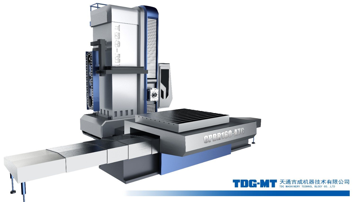
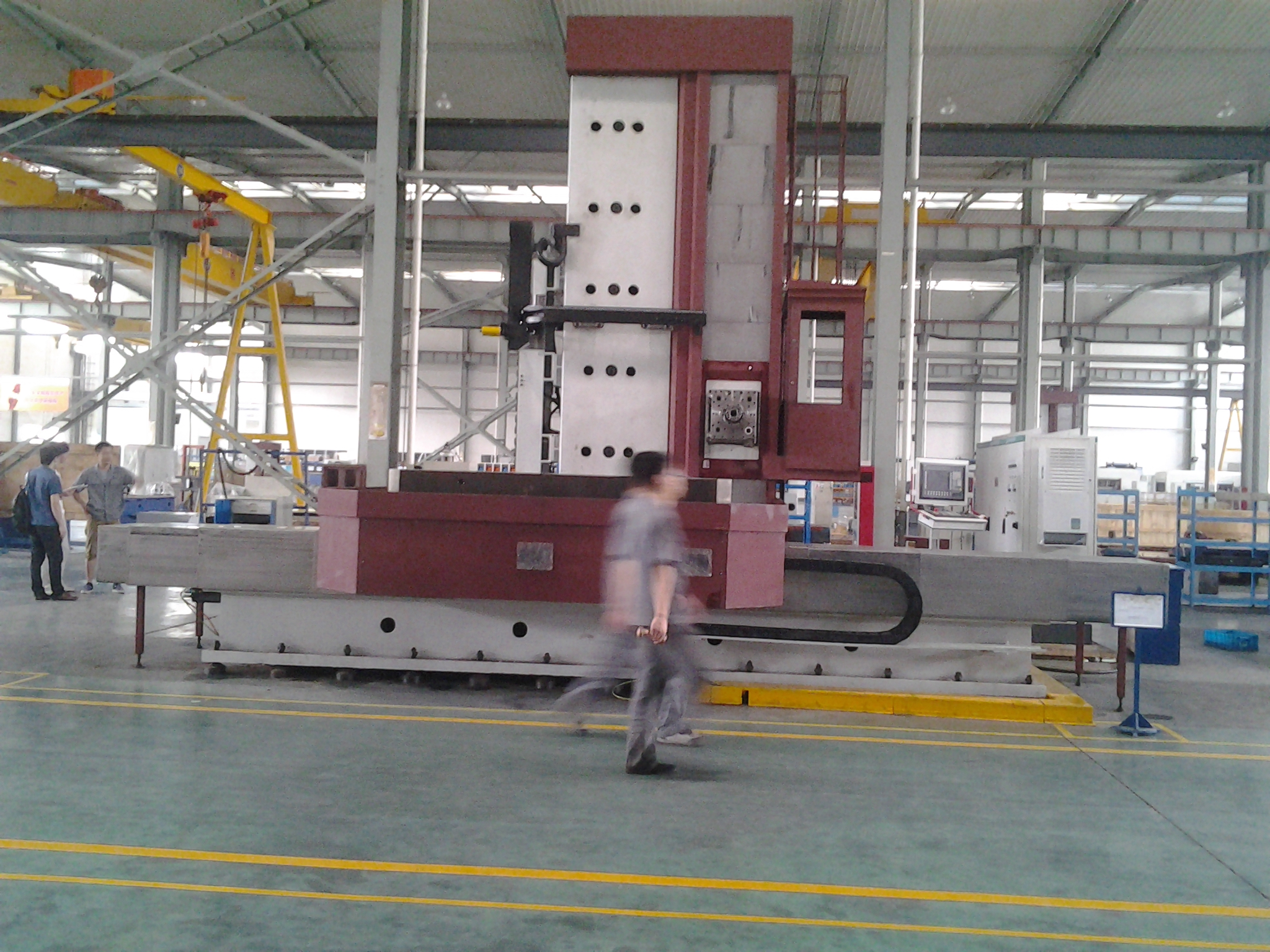
EQPID redesigned the floor type boring and milling machine to transform a traditional heavy industrial machine into a professional and recognizable industrial product.
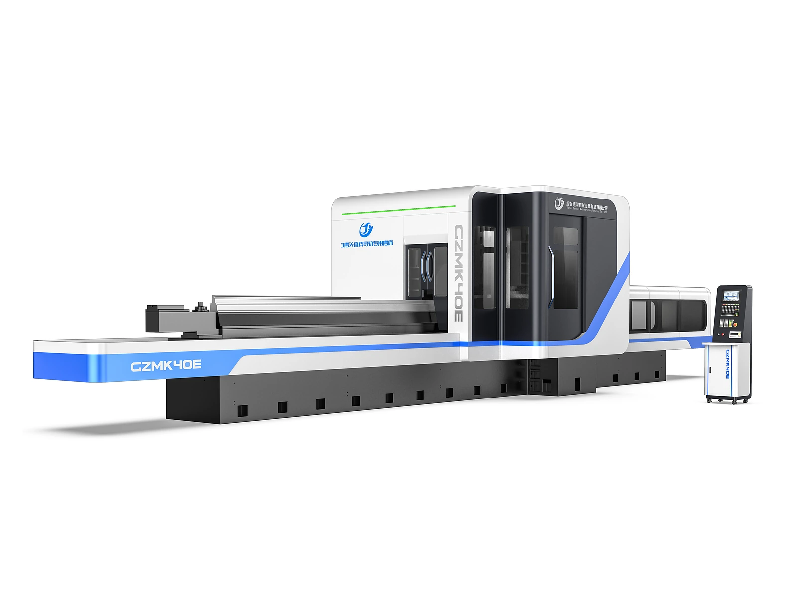
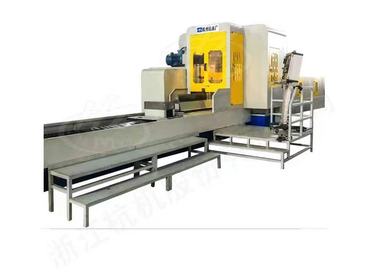
EQPID transformed a function-led, visually fragmented grinding machine architecture into a more integrated industrial product through a unified enclosure, clearer functional hierarchy, disciplined CMF, and a stronger product identity.
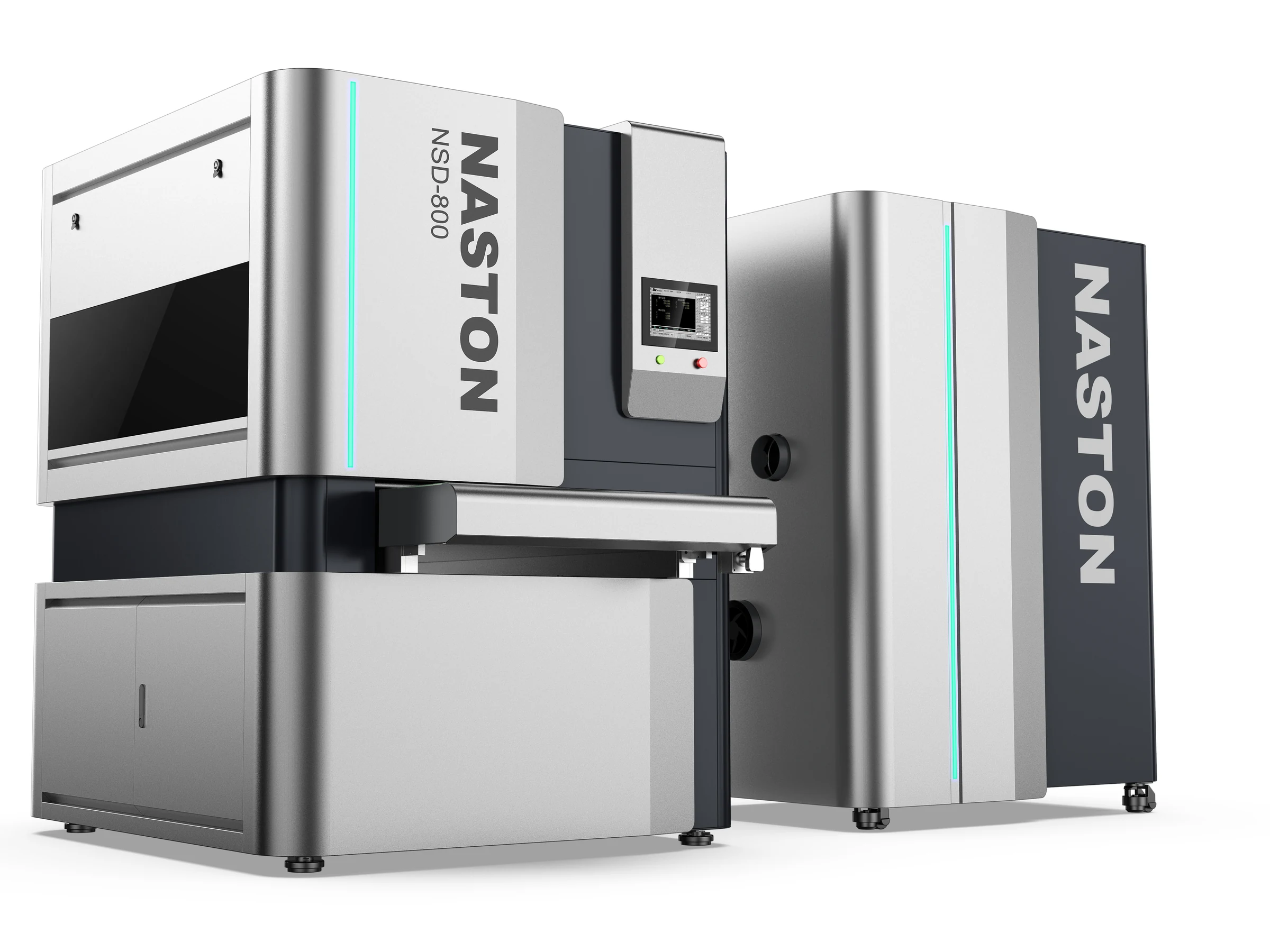
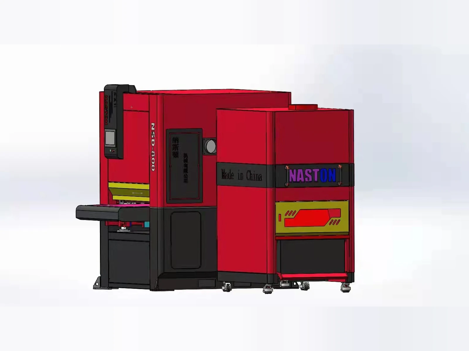
EQPID redesigned the NSD-800 polishing machine around a clearer product architecture, reorganizing its functional modules, operator interface, CMF and brand expression into a more integrated and recognizable industrial product.
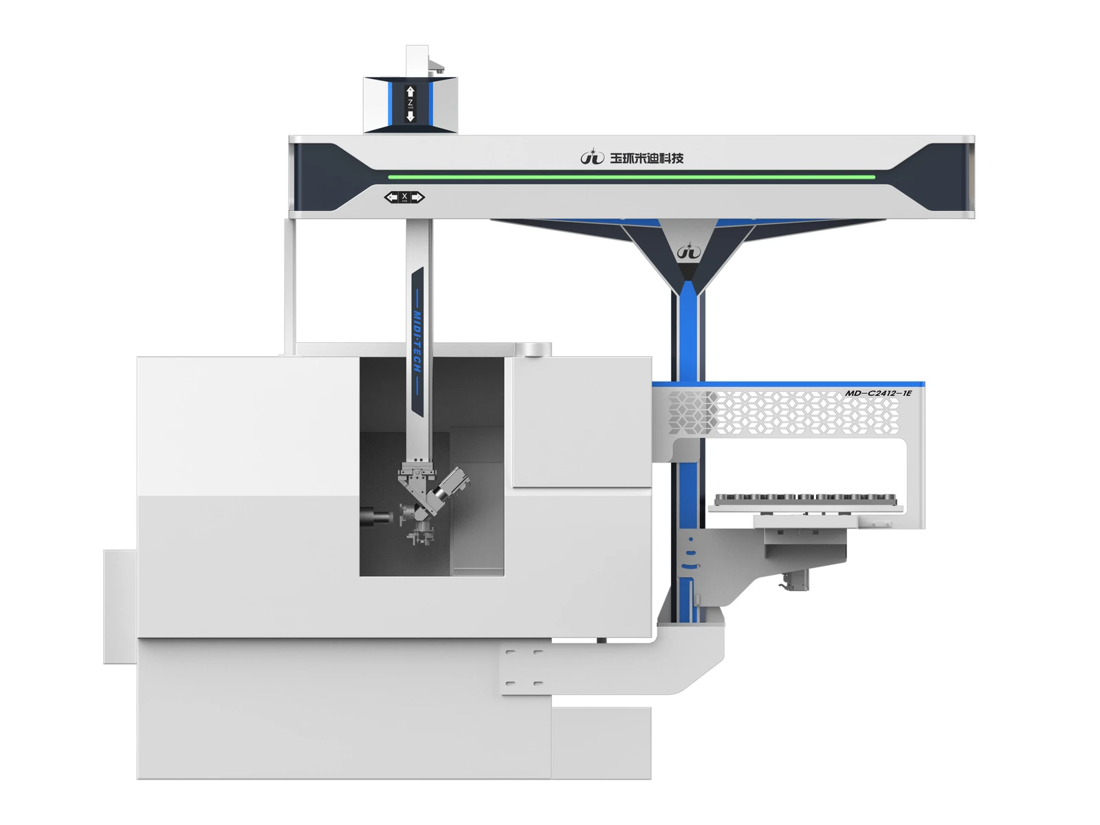
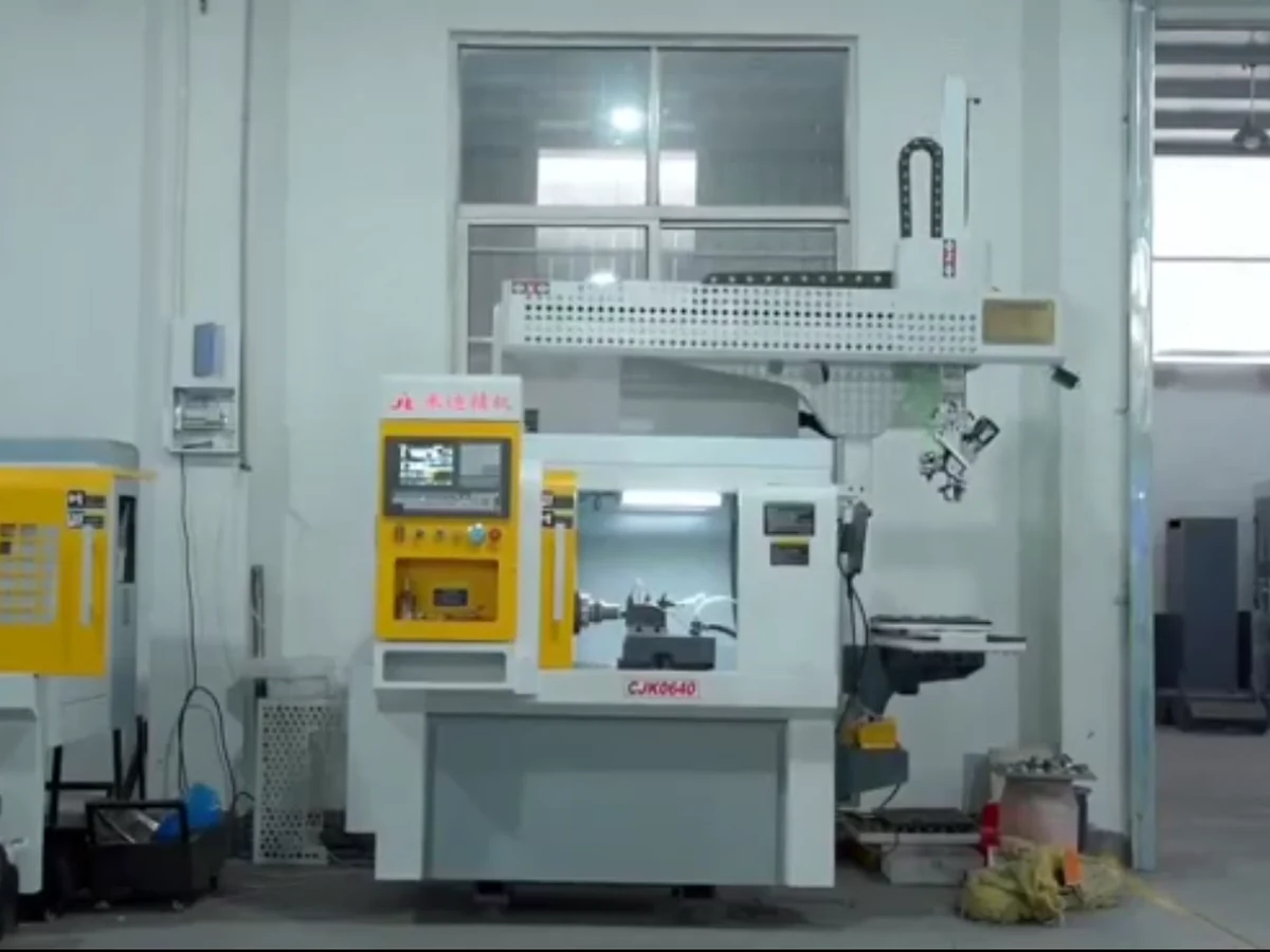
For a machine-tool loading and unloading application, EQPID reorganized the gantry beam, Z-axis module, material handling area, and machine body into a more integrated automation product with clearer hierarchy and stronger visual identity.
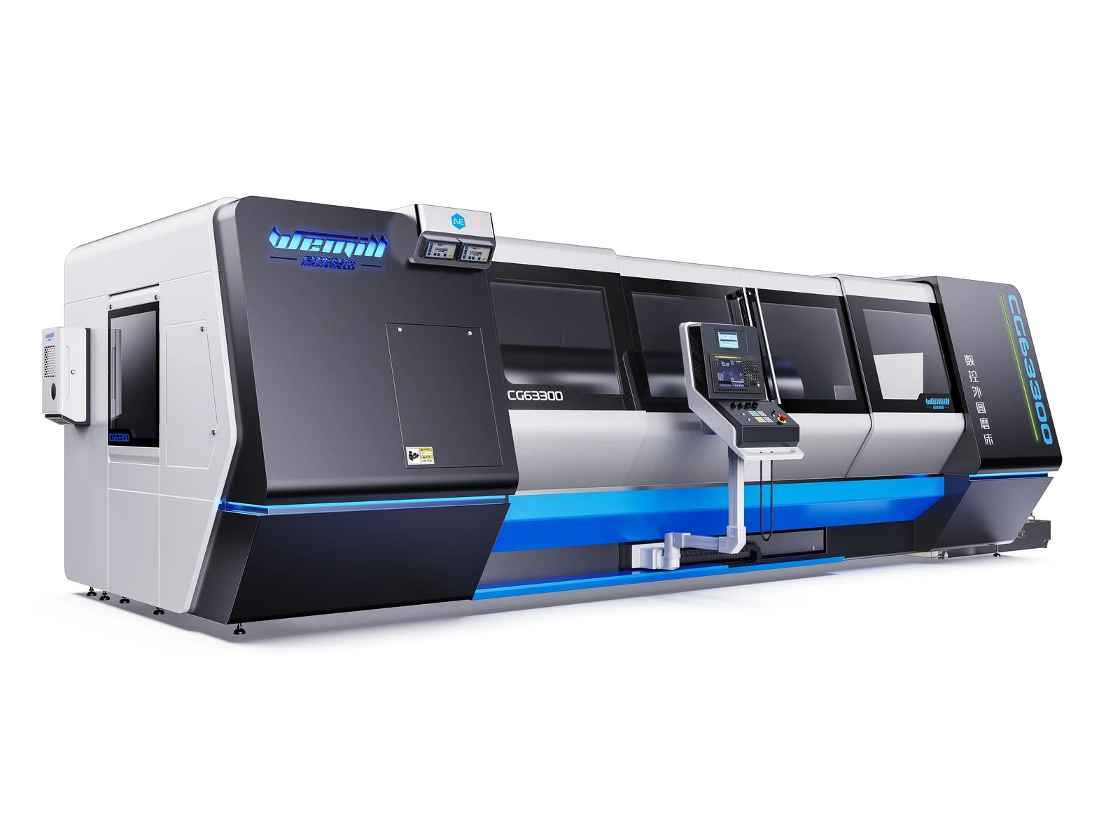
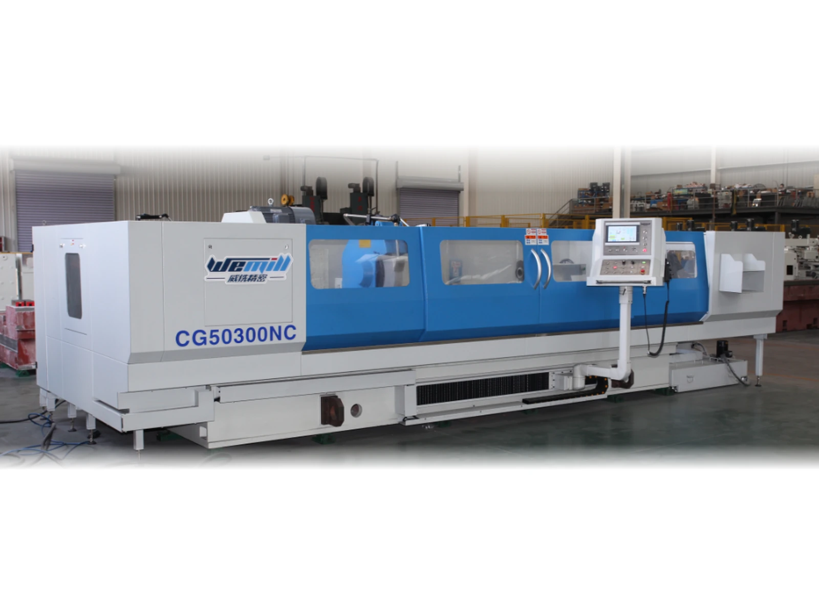
A long-body CNC cylindrical grinder reorganised into one coherent product: directional end geometry, rhythmic observation windows, an integrated operator pendant and a single ice-blue CMF thread that gives the machine a recognisable identity.