CASE STUDY
EQPID redesigned the NSD-800 polishing machine around a clearer product architecture, reorganizing its functional modules, operator interface, CMF and brand expression into a more integrated and recognizable industrial product.
The original NSD-800 polishing machine already contained a complete functional equipment architecture, but its exterior was dominated by separate box-like volumes, saturated red surfaces, black horizontal bands, yellow accent areas and dispersed brand graphics.
These elements competed for attention and made the machine read more as an assembly of engineering modules than as one coherent industrial product.
EQPID focused on rebuilding the machine's visual order without disrupting the main working opening or the functional separation between modules. Silver outer panels, dark functional cores, repeated corner radii, vertical brand surfaces and restrained light accents were used to bring the equipment into one consistent product architecture.
The polishing machine combines several functional volumes that need to remain distinct for operation, access and maintenance. The challenge was to keep those engineering relationships intact while preventing them from becoming a fragmented exterior structure.
In the original design, large red surfaces were combined with black bands, yellow accent panels, text and logos across different areas. The operator interface also appeared more like an attached component than a clearly defined part of the main product interface.
The redesign therefore needed to create clarity through fewer, stronger design decisions—not by adding complexity, but by organizing it.
Before the redesign, recognition depended heavily on saturated red surfaces, black horizontal bands, yellow details and dispersed graphics.
The functional modules were visually expressed as separate boxes, with limited continuity between engineering structure and brand identity.
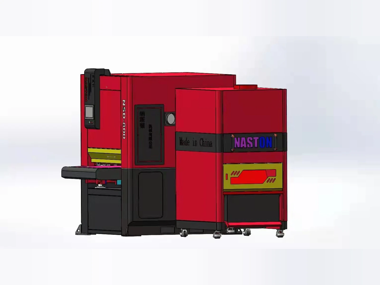
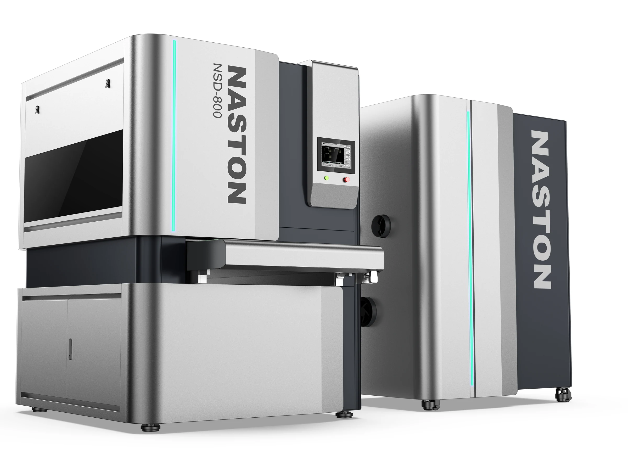
The redesign first establishes a clearer hierarchy across the machine. Previously independent cabinet-like volumes are visually connected through repeated silver vertical shells, dark central cores, consistent corner radii and controlled panel proportions.
The functional modules remain clear, but the sense of visual assembly is significantly reduced.
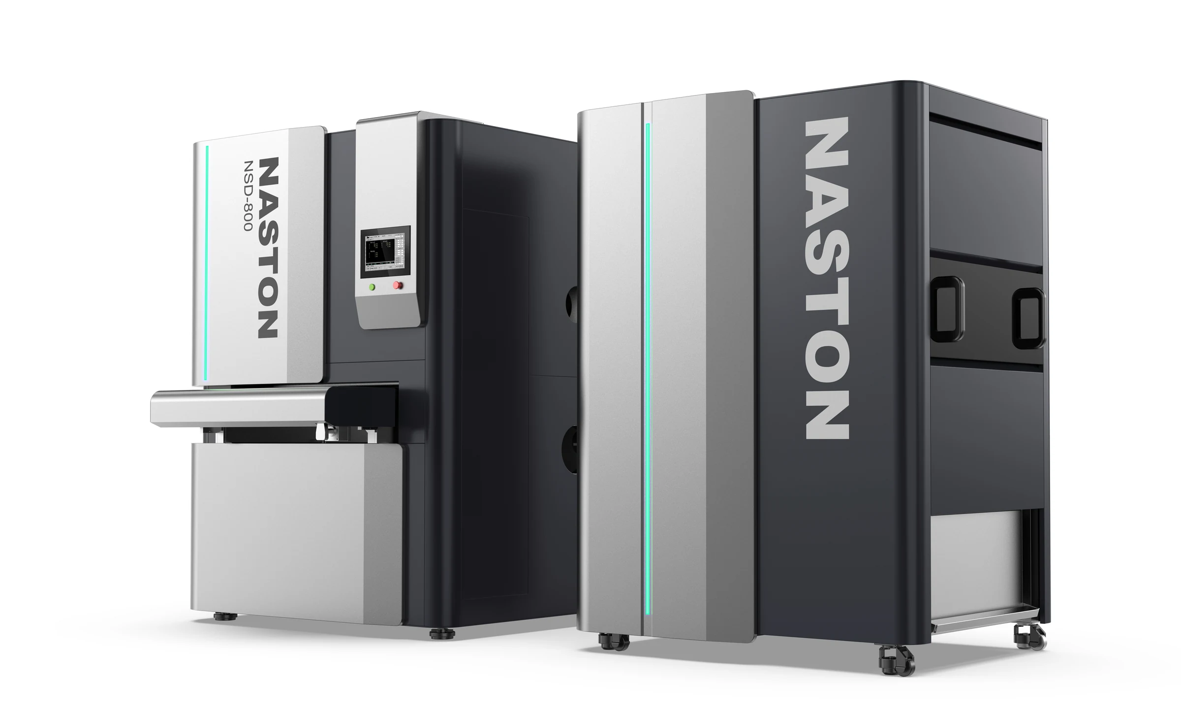
The new CMF system is built around silver, charcoal and restrained cyan light accents. Silver defines the primary brand surfaces, charcoal contains the operator and functional zones, while the light lines create a controlled technological signature.
Compared with the original design, color now supports structure, hierarchy and recognition rather than competing as decoration.
The control interface is integrated into the central dark functional zone and visually connected to the main working area.
It no longer reads as an isolated add-on, but as a clear node within the front architecture of the machine.
The NASTON name and NSD-800 model marking are incorporated into the vertical primary panels, aligned with the proportions, panel transitions and lighting language of the enclosure.
Brand identity is therefore carried by the product architecture rather than by logos alone.
The visual language relies primarily on large sheet-metal surfaces, consistent bend radii, controlled seams and repeatable panel relationships rather than excessive sculpted forms.
This creates a practical design foundation for downstream engineering development and future model extension.
The working zone, operator interface and main machine volumes are given clearer visual relationships, making the basic functional organization easier to understand.
Stronger silhouette control, disciplined CMF, integrated branding and repeated panel geometry transform a fragmented engineering appearance into a more complete industrial product identity.
The design language is developed around repeatable sheet-metal volumes, panel logic, bends and seams rather than unnecessary geometric complexity, creating a realistic basis for engineering development.
Good to Use · Good to Look At · Good to Manufacture
Before the redesign, the functional modules were visually expressed as separate boxes, and product recognition relied mainly on high-saturation color blocks and applied graphics.
After the redesign, silver vertical shells, charcoal functional cores, consistent radii, cyan light lines and large brand panels create a unified product language. The operator interface is more clearly connected to the working zone, and brand recognition is carried by the machine architecture itself.
The transformation goes beyond a cosmetic refresh. It moves the equipment from a functional engineering configuration toward a more complete industrial product with clearer architecture and stronger brand presence.
The final design significantly reduces visual noise and brings the machine's separate functional modules under one consistent design system.
Silver primary surfaces, dark functional zones, vertical light accents and integrated branding establish a clearer and more distinctive identity.
The machine shifts from an appearance driven by individual engineering modules and decorative color blocks to one defined by product architecture, functional order and brand continuity. The design also creates a reusable foundation for future model extensions and product-family development.
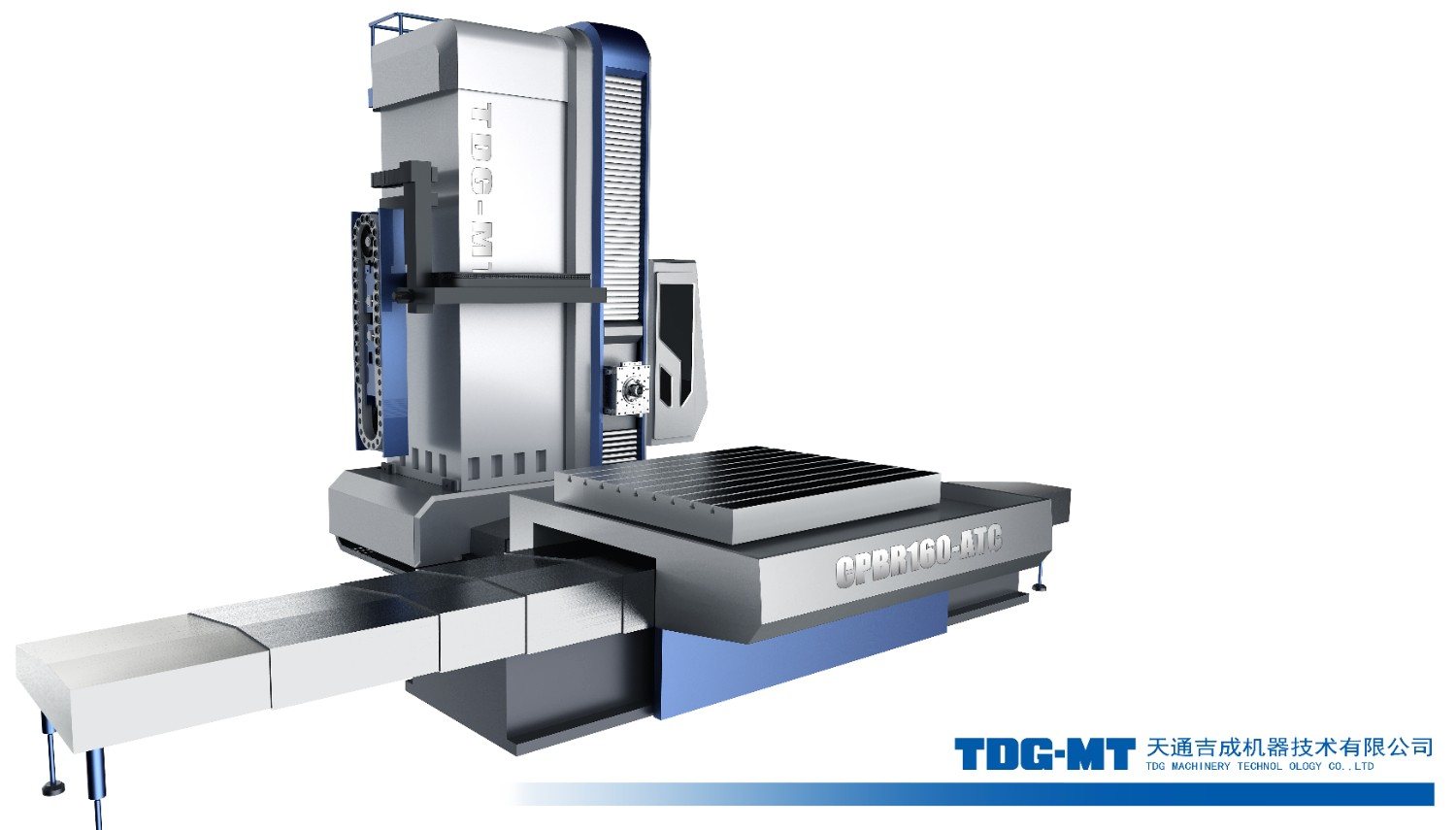
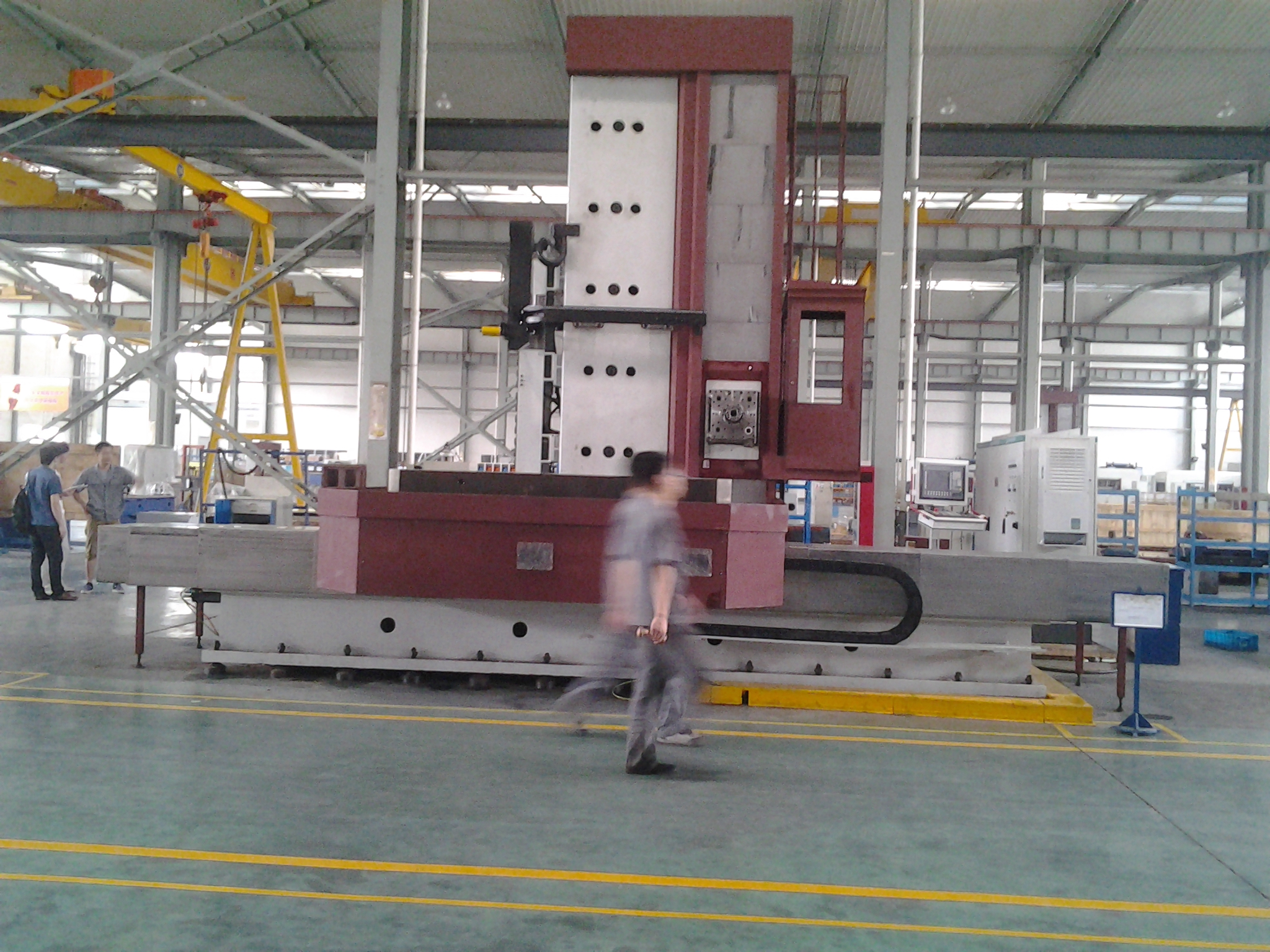
EQPID redesigned the floor type boring and milling machine to transform a traditional heavy industrial machine into a professional and recognizable industrial product.
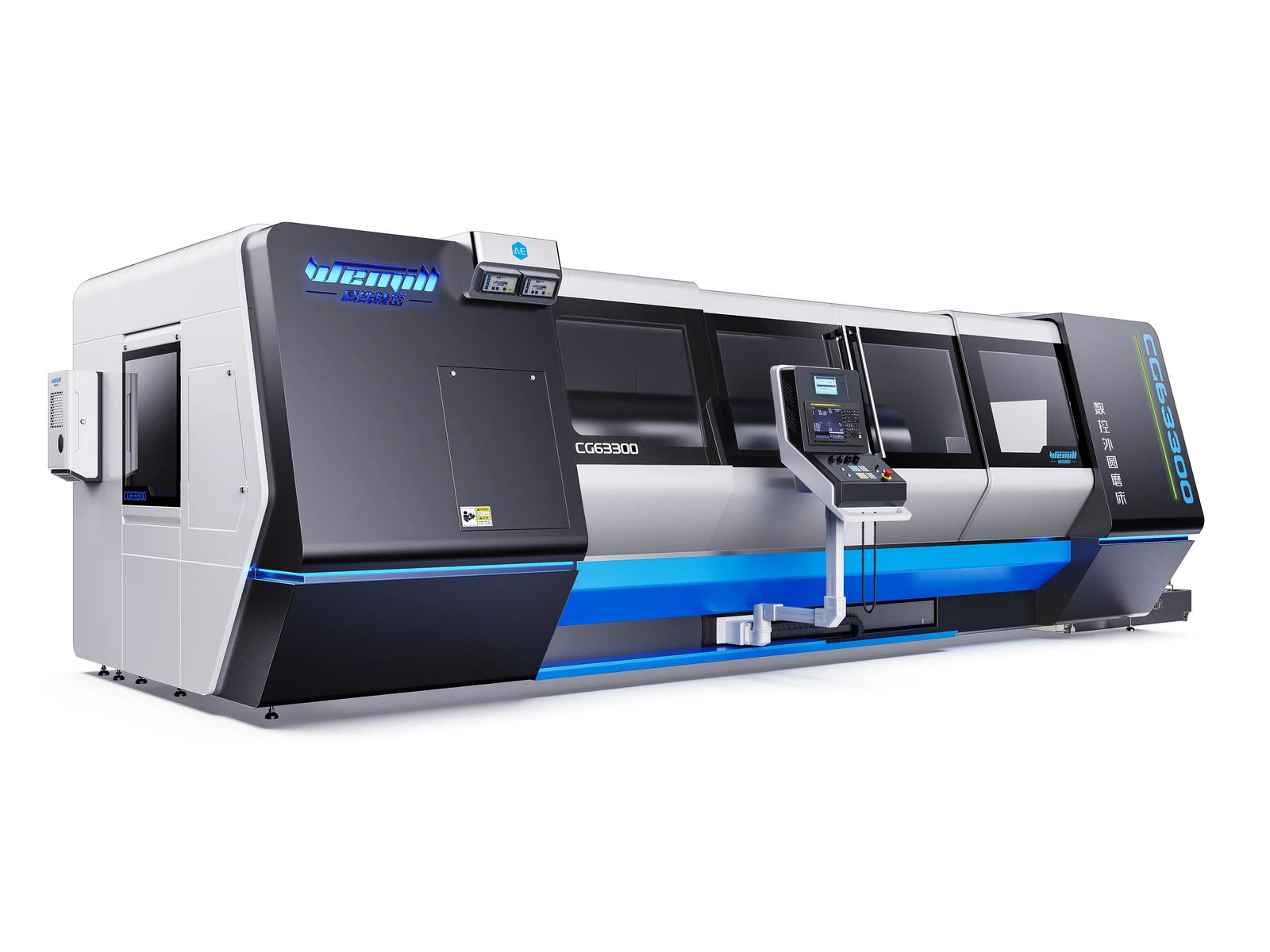
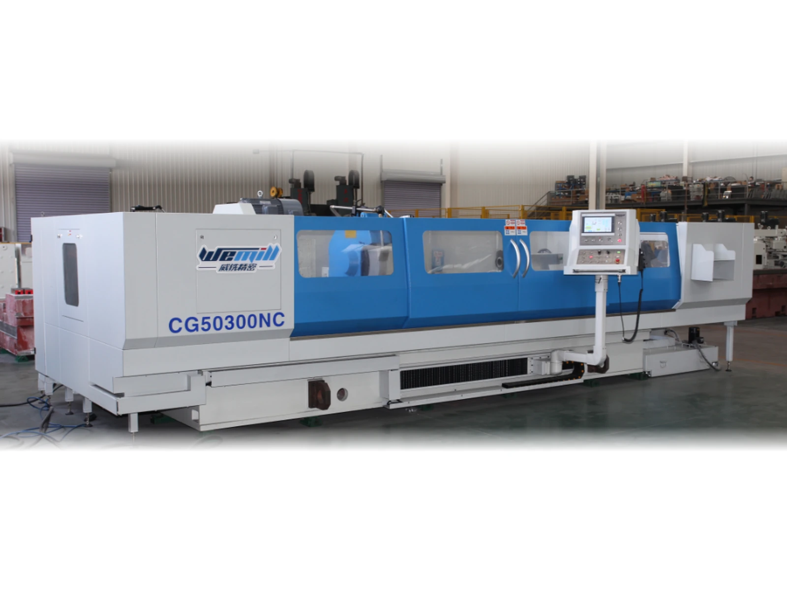
EQPID developed an exterior design proposal for the CG63300 large CNC cylindrical grinding machine, unifying its enclosure, viewing areas, operator interface and CMF.
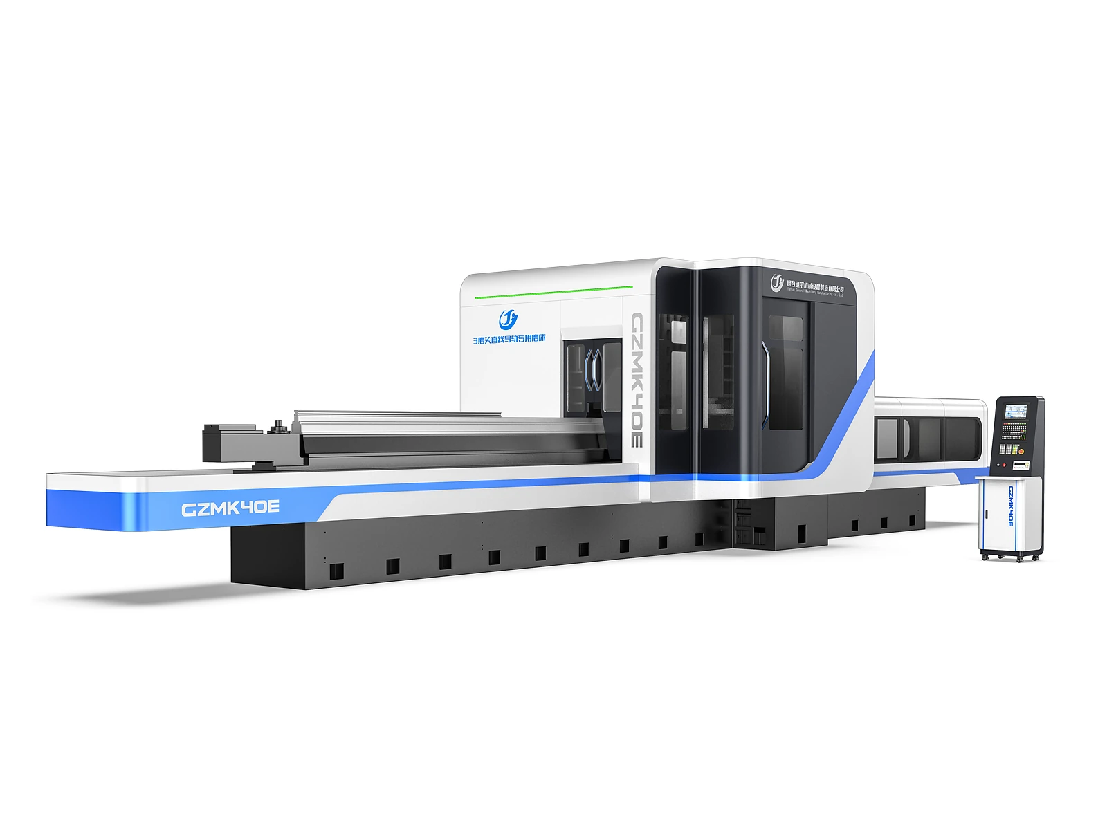
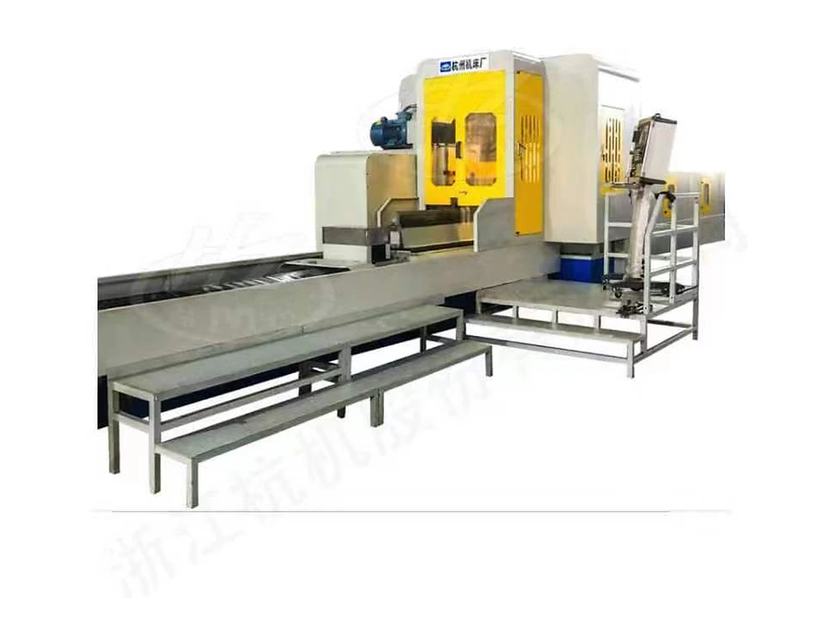
EQPID transformed a function-led, visually fragmented grinding machine architecture into a more integrated industrial product through a unified enclosure, clearer functional hierarchy, disciplined CMF, and a stronger product identity.
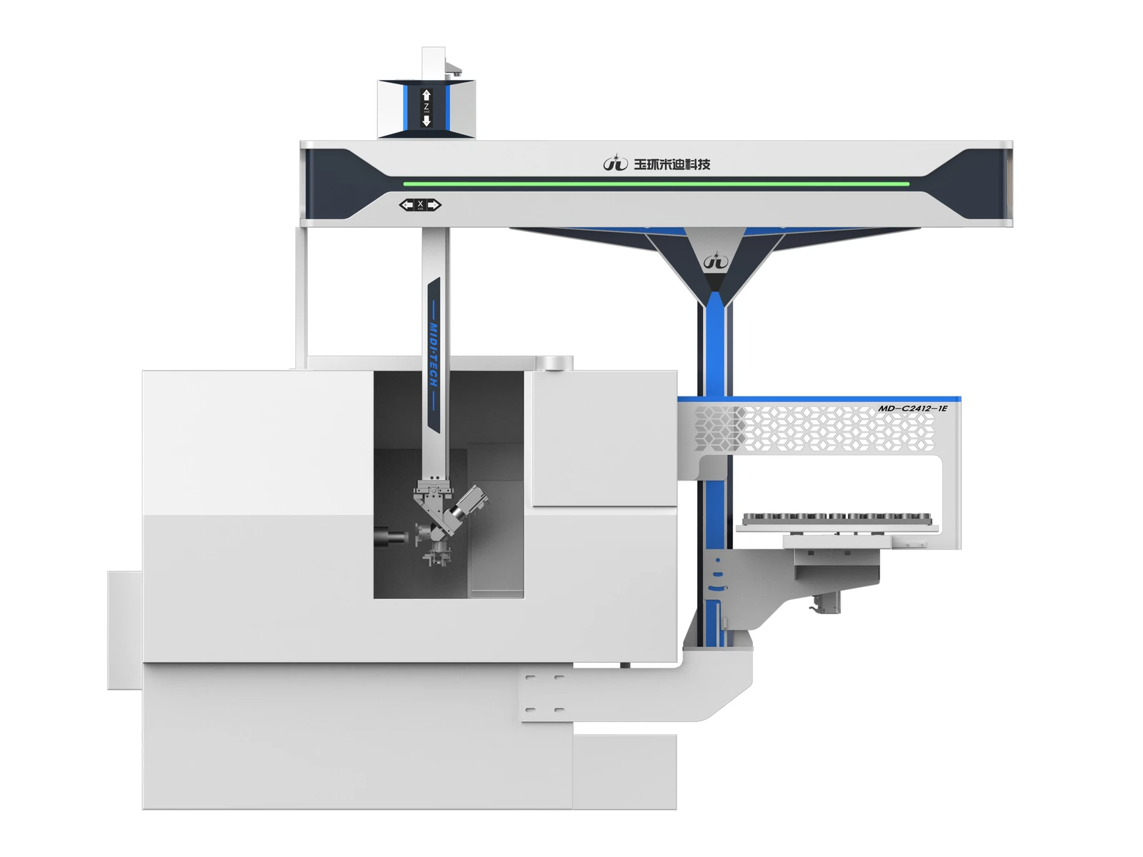
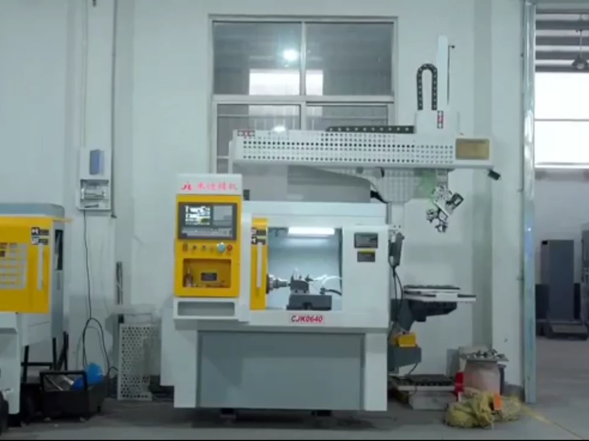
For a machine-tool loading and unloading application, EQPID reorganized the gantry beam, Z-axis module, material handling area, and machine body into a more integrated automation product with clearer hierarchy and stronger visual identity.