CASE STUDY
A casting machine gains clearer visual hierarchy through coordinated equipment volumes, panel divisions and a consistent gray-and-green identity.
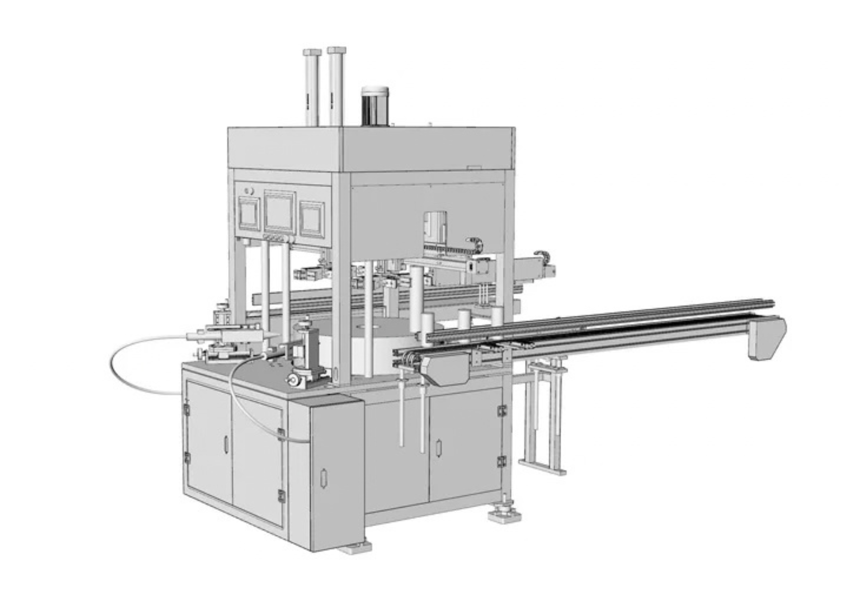
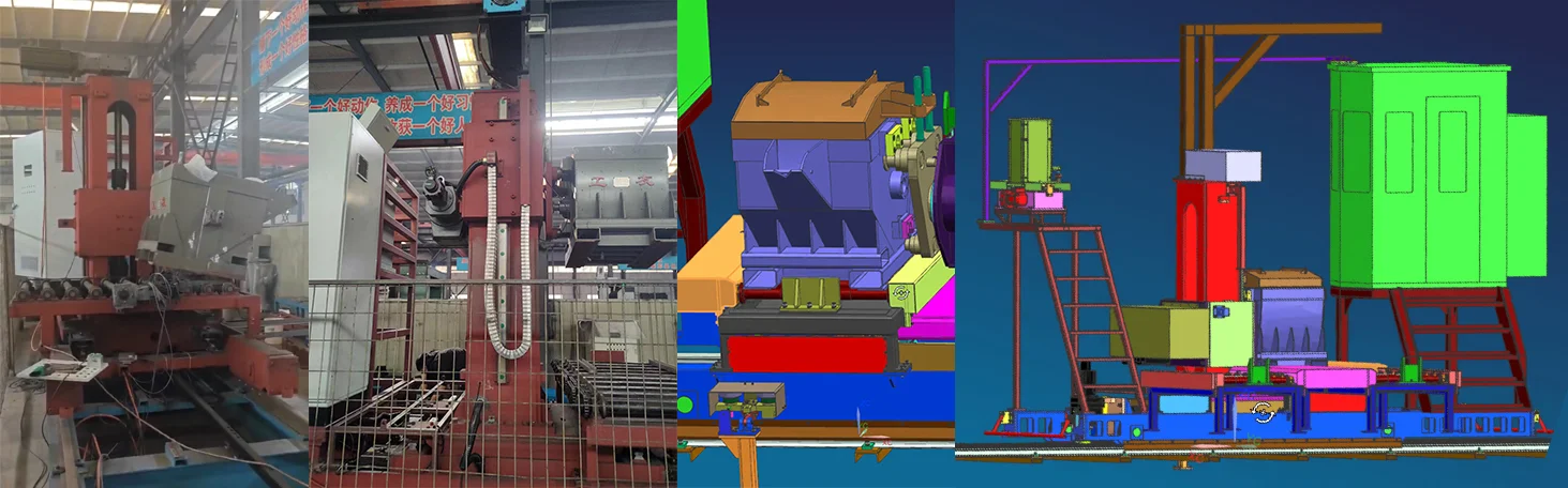
The casting machine combined a hopper, lifting structure, control area and base. Its existing arrangement lacked a consistent relationship between the volumes, colors and exposed structural details.
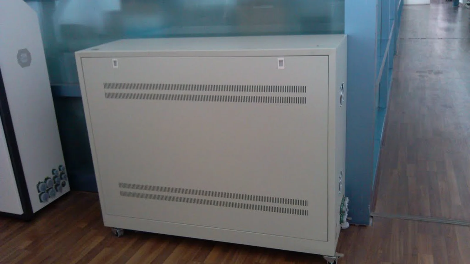
The original project material records a fragmented appearance, conspicuous seams and fasteners, and inconsistent branding. The exterior upgrade focused on visual order and a recognizable equipment identity.
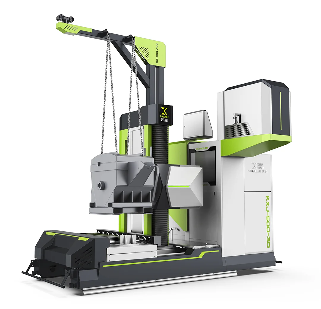
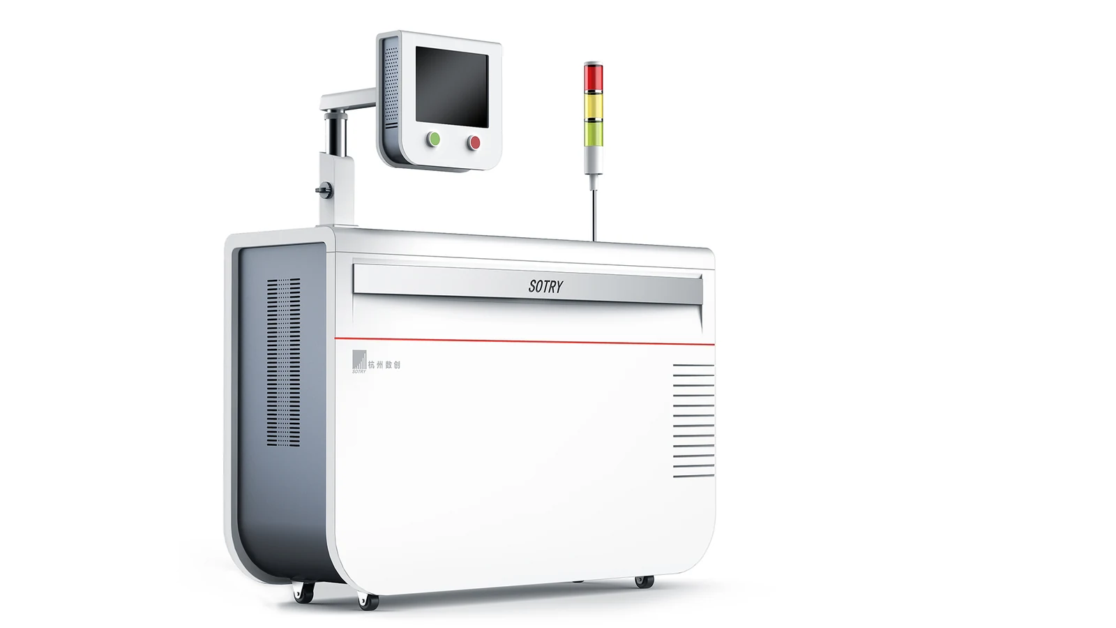
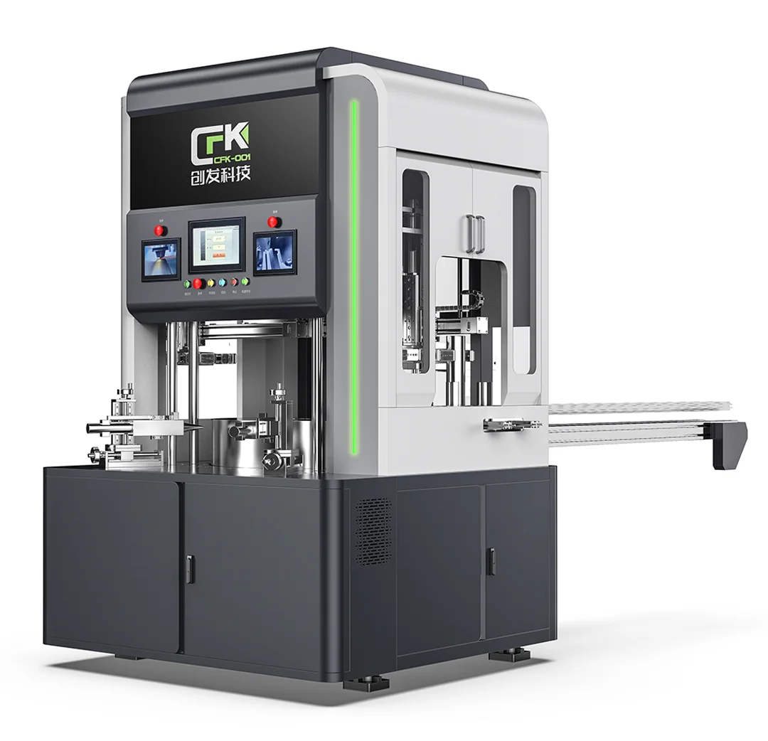
The redesigned exterior brings the upper control enclosure, vertical structure and lower base into a coordinated composition. Panel divisions and transitions distinguish the functional areas while connecting them visually.
The design rendering uses light gray and dark gray as the main colors, with green accents on the lifting structure, control enclosure and base. Repeating these accents gives the machine a consistent identity across its different levels.
Brand and model graphics are placed within defined areas of the enclosure. The visible outcome is a more organized casting-machine exterior, rather than a collection of independently styled components.