CASE STUDY
Exterior design for an auxiliary manipulator: large-diameter silver-grey joints with black end caps, a matte-black finned power column, and two capsule brand plates — invisible assist capability translated into a visible, trustworthy form language.
Beside the assembly line, an auxiliary manipulator lifts, moves and places what human strength cannot. The "assist" itself is invisible: motor torque, transmission precision, control response — all hidden inside the housing. The exterior design of this manipulator is a work of translation: turning invisible capability into a form language workers can read at a glance and are willing to trust.
Built for a smart technology company, the project focuses on the exterior design of the sheet-metal and structural parts. Silver-grey joints, a matte-black column, two capsule-shaped brand plates — three elements speaking separately, together saying one word: precision.
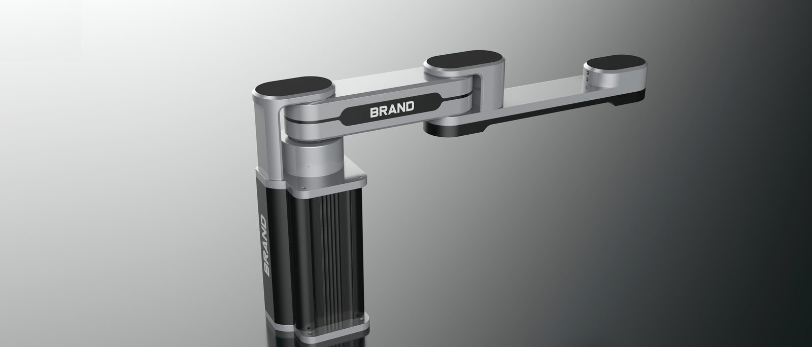
The two most eye-catching elements on the arm are the joints: large-diameter silver-grey cylinders capped with black discs, cleanly chamfered. Why so large? Because a worker's first judgment of "assist" comes from the volume of the joints — diameter stands for strength, and a robust joint visually promises torque and stiffness, giving confidence no matter how far the arm reaches. Slimmer segments link the joints, and the rhythm of thick and thin draws the force path directly onto the form: from the column, through the upper arm and forearm, to the end of the arm.
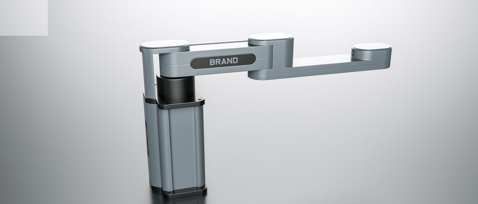
The column is the power bay of the whole machine: matte black separates it materially from the silver arm, and vertical cooling fins line up one by one — dissipating motor heat while writing "there is power in here" on its face. A dark skirt closes the base, and the mounting-flange holes stay neatly exposed — the honest look of an industrial machine: never hiding that it is a machine, never neglecting the order of any detail.
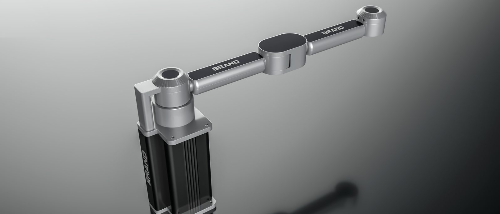
Brand recognition is compressed into the most economical expression: one horizontal capsule plate on the upper arm, one vertical plate on the column, brand lettering set into dark grounds — the large silver surfaces stay restrained, leaving recognition to these two dark plates. From afar, a horizontal line on the arm and a vertical line on the column form a stable cross order; up close, the lettering reads clearly. And when a worker's hand actually grips the end effector — adjusting pose, changing tools — the chamfers and seams make every contact smooth. Where the distance between machine and person disappears, design faces its true test.
Design translation: capability that exists is not capability expressed. Only when transmission precision and control algorithms are translated into the volume of joints, the order of fins and the rhythm of seams will users read "this machine can be trusted."
For a manipulator that works with people every day, appearance is not packaging but communication: strength drawn on the joints, power tucked into the column, the name set on the capsule plates — no spec sheet needed; the moment a worker raises the arm, they already know this helper can be trusted.


An exposed engineering assembly becomes a coherent robot system through functional zoning, a brushed stainless-steel enclosure and visible status lighting.

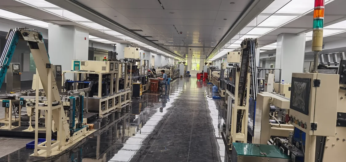
A large battery production line is transformed into a unified industrial product through integrated enclosures, continuous visual language, coordinated CMF and status lighting that communicates machine conditions at a distance.
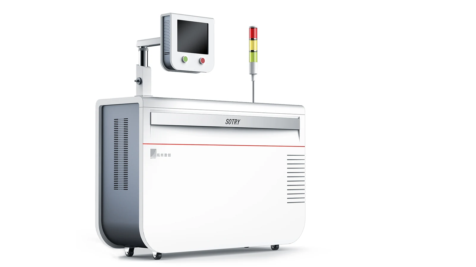
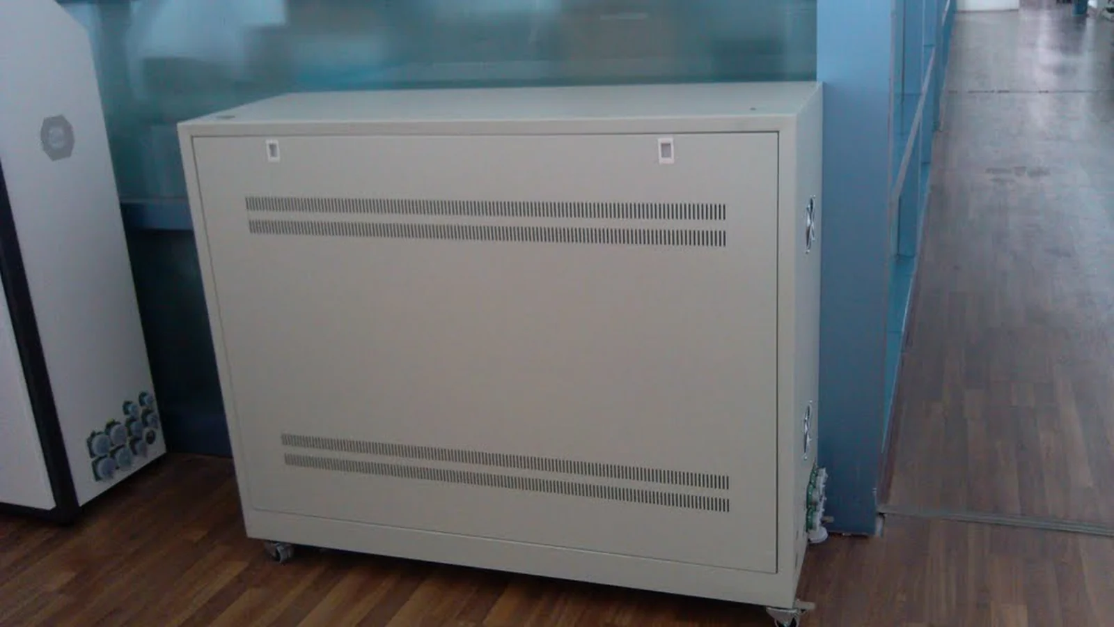
A conventional production-line control cabinet is redesigned with a clearer operator interface, integrated ventilation zones and a more coherent industrial product language.