CASE STUDY
Exterior design for a laundry feeder: a chamfered top profile and white-blue formal language build line-level recognition, transparent guards and three workstation panels let the work zone explain itself, and systemic consistency carries quality across several meters of body.
In a laundry plant, equipment appears as an array: washers, dryers, ironers, feeders and folders line up along the process flow, each one a multi-meter volume. When buyers walk between the lines to compare suppliers, they see more than a machine's specifications — they see the order of an entire workshop. When a manufacturer of laundry equipment set out to finalize its new-generation feeder for mass production, the core question we received was clear: among a row of similar large machines, make this one recognizable — and make its maker memorable.
It is a brand-level question, but the answer lies in every concrete design move.

The redesigned feeder layers a clear blue language over a white base: the top enclosure chamfers into a wedge-shaped profile running from one end to the other, giving the multi-meter body a sense of direction. The electrical cabinets on both sides are segmented with two-tone white and blue door panels, and a blue diagonal accent band follows the form's movement down at the skirt line — not a sticker-like graphic, but a turn of the form itself.
The primary view (the operator's side) is fully planned: a central touchscreen suspended at eye level, three workstation panels flanking the wide-open work zone, with red, green and yellow buttons following the industry's familiar emergency / start / stop logic. From afar, the white-and-blue relationship reads clean and stable; up close on the line, operators never have to search for where to stand.

The heart of the feeder is the wide-open roller conveying zone, where linen is spread and sent into the next process. Two transparent guards enclose this zone entirely: the rollers turn and the linen advances, fully visible throughout. Operators feed, align and handle exceptions from the workstation panels without taking their eyes off the fabric.
The Shuizhe methodology defines "in-task interaction" precisely: it is not observation from zero meters, but the moment distance disappears and people truly engage with the machine. Here that engagement happens at three workstations — the feel of the buttons, the visible motion inside the guards, and the live state on the touchscreen together build the operator's full trust in the machine.
The feeder's sheer size means it will be seen from many distances and angles: front, side, oblique, from the end of a corridor. Craft quality on large equipment must rest on systemic consistency — the primary visual face, the operating zones, the maintenance areas and the back all answer to one quality standard; excellence in a detail alone does not carry the whole.
So the panel seams, door panels, hardware and blue accent band all follow one logic across the machine: approach it from any angle and you see the same language. When it stands in a full laundry line, side by side with its siblings, that consistency becomes the undertone of the brand.
Brand recognition does not come from the few letters on the side panel. Higher-level far-view recognition should not rely on explicit markings alone — it forms a brand impression through the product language itself.
Contour, color and order — that is how this machine speaks for its maker. The next time a buyer walks the full laundry line and looks back, we hope that touch of blue and white has already stayed in their memory for this company.

Exterior design for a benchtop microjet homogenizer: the enclosure language is reasoned backward from sheet-metal constraints, a silver-white body and black control deck form a two-volume order, and a single green line marks the operating side — a clean, restrained image that holds up up close.


Exterior design for a benchtop servo press: a C-shaped arch body folded in sheet metal strengthens the pressing-machine silhouette, a cyan light band set into the seam states machine status, and orange perforated guards turn the safety zone into a visual part — certainty made visible.
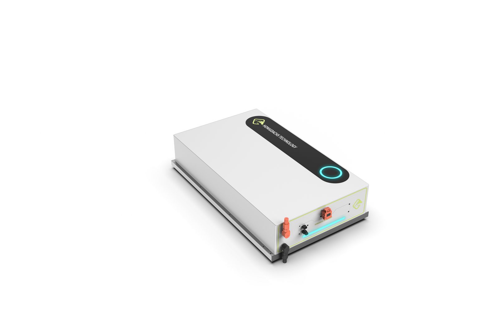
Exterior design for a battery module: a low flat volume with a slide-rail base serves the stacking logic, a black top plate with a cyan ring status light anchors brand recognition across the array, and the interface face separates high-voltage warning, status and maintenance zones with a clear color order.