CASE STUDY
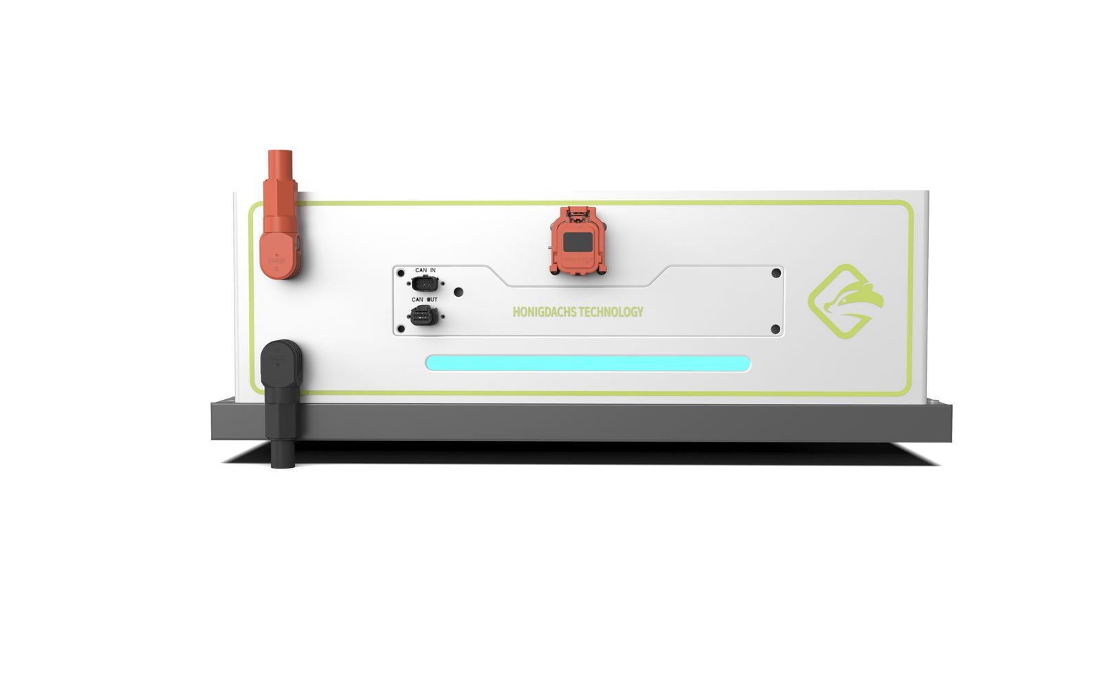
Exterior design for a battery module: a low flat volume with a slide-rail base serves the stacking logic, a black top plate with a cyan ring status light anchors brand recognition across the array, and the interface face separates high-voltage warning, status and maintenance zones with a clear color order.
A battery module never exists alone: it is born to be stacked, paralleled and replicated. The exterior design of a single unit is therefore not the design of one machine — it is the writing of a family's DNA. For this module, the design started from a question: how will this unit appear inside an array?
This battery module, built for an energy technology company, serves energy storage and power applications. The project focuses on the exterior design of the sheet-metal enclosure: a low flat volume, one top plate, one light band, one interface face — every decision made to serve stacking and replication.
The body proportion is compressed into a low, flat volume: a stable rectangular ratio between width and length, with height yielding to the stacking logic — placed alone, side by side, or stacked, the silhouettes never conflict. A dark-grey slide-rail base wraps the bottom, serving as the structural element for handling and installation while giving the unit a visual footing. Small corner radii and large folded sheet-metal planes give the array a uniform rhythm.
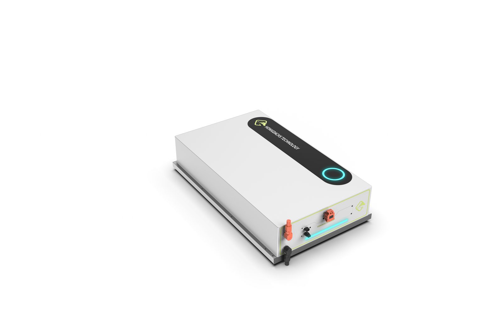
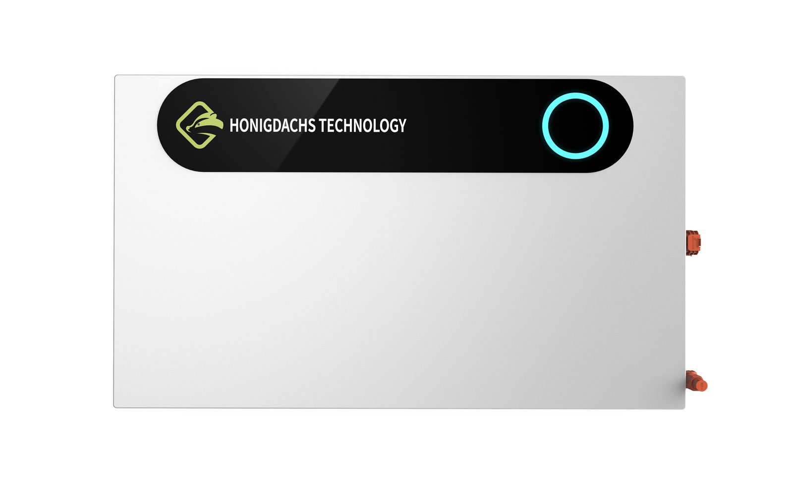
The only protagonist on the top surface is a black capsule-shaped plate: the brand mark sits at its left end, a cyan ring status light at its right. The large white plane stays restrained, handing recognition and status to this dark plate — from afar, every module in the array shares the same clear visual anchor on its top face; up close, the ring light's on/off is an honest statement of machine state. Brand consistency here does not come from stickers everywhere, but from the order this plate creates as it repeats across the array.
The side elevation is the module's operating face: an orange high-voltage connector on the left, black communication and low-voltage ports in the center, a cyan status light band running along the lower edge, and the brand mark on the right. Orange is the only color for high-voltage warning — fixed position, recognizable at a glance; the cyan band speaks for working status in one language. A yellow-green outline frames the whole interface zone, marking the opening range for maintenance and wiring: what can be touched, what is dangerous, and how the machine is doing — all readable at once in front of the module.
Every design decision has to survive being replicated a thousand times: the top plate is a standard injection-molded part, identical on every unit in the array; the light band and connector cutouts are punched into the sheet metal in one stroke, with tolerances that keep alignment across assembled modules; the slide-rail base shares one set of tooling, with defined interfaces for guiding and locking in a stack. What the design delivers is not just a good-looking module, but a set of family rules ready for batch replication and assembly.
For products of this kind, the completeness of one unit is the completeness of the array. The next generation of the module will carry the same plate, the same cyan light and the same slide-rail interface — as the family grows, users will still recognize at a glance: they speak the same design language.

Exterior design for a laundry feeder: a chamfered top profile and white-blue formal language build line-level recognition, transparent guards and three workstation panels let the work zone explain itself, and systemic consistency carries quality across several meters of body.

Exterior design for a benchtop microjet homogenizer: the enclosure language is reasoned backward from sheet-metal constraints, a silver-white body and black control deck form a two-volume order, and a single green line marks the operating side — a clean, restrained image that holds up up close.


Exterior design for a benchtop servo press: a C-shaped arch body folded in sheet metal strengthens the pressing-machine silhouette, a cyan light band set into the seam states machine status, and orange perforated guards turn the safety zone into a visual part — certainty made visible.