CASE STUDY
Exterior design for a vertical steam generator: disciplined cabinet form over an exposed frame, an instrument-grade black control interface with a cyan state light, and three complete CMF colorways that give one design language three expressions across showroom, food-medical and commercial scenes.
In the thermal equipment industry, a steam generator barely needs an introduction: connect power, connect water, get steam — its function is written into the industry's history. And precisely because it is so "functional," most products look alike: a stainless-steel frame, exposed contactors and pipework, a cold-rolled door with labels stuck on. When a manufacturer of thermal equipment set out to finalize its next-generation machine for mass production, the goal was clear: give this machine an expression of its own, beyond its function.
We structured the exterior design in three layers: define the form first, then the interface, and finally a set of colorways that give the machine different expressions for different scenes.
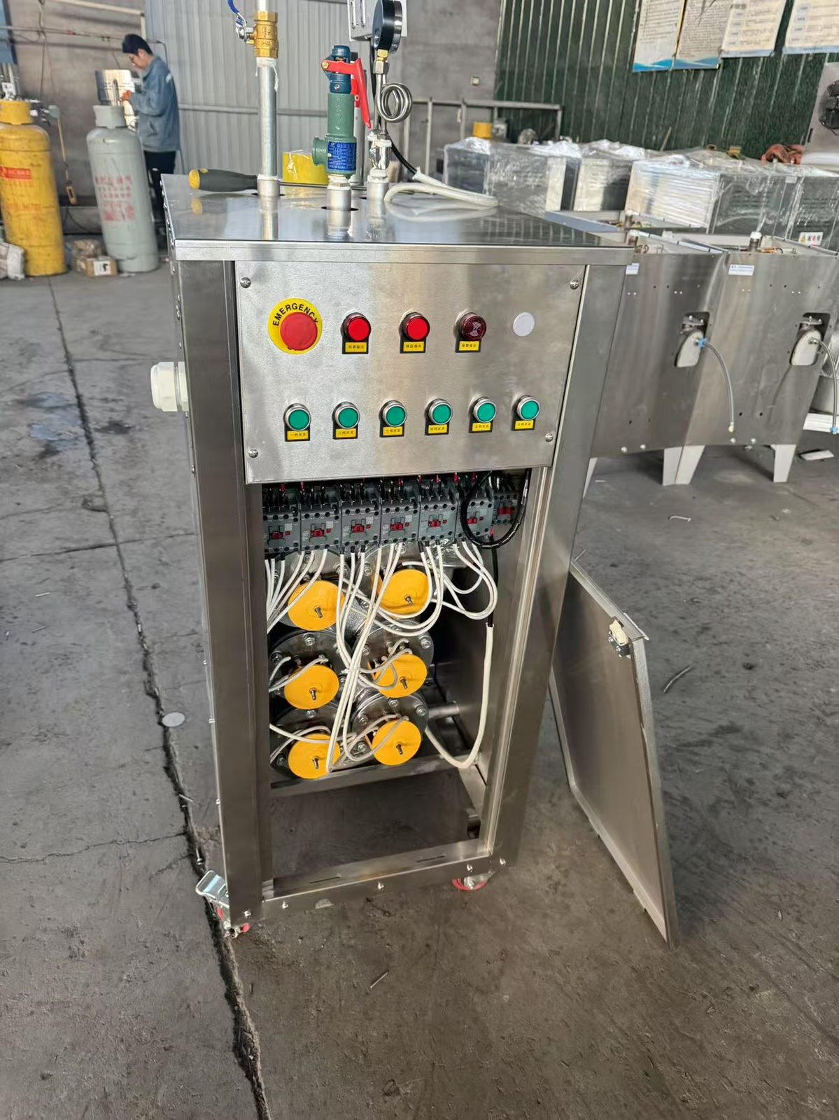
The original prototype was an "honest" stainless-steel frame: contactors, heating assemblies and pipework entirely exposed. As a prototype, its logic was legible; as a product, there was no logic to speak of.
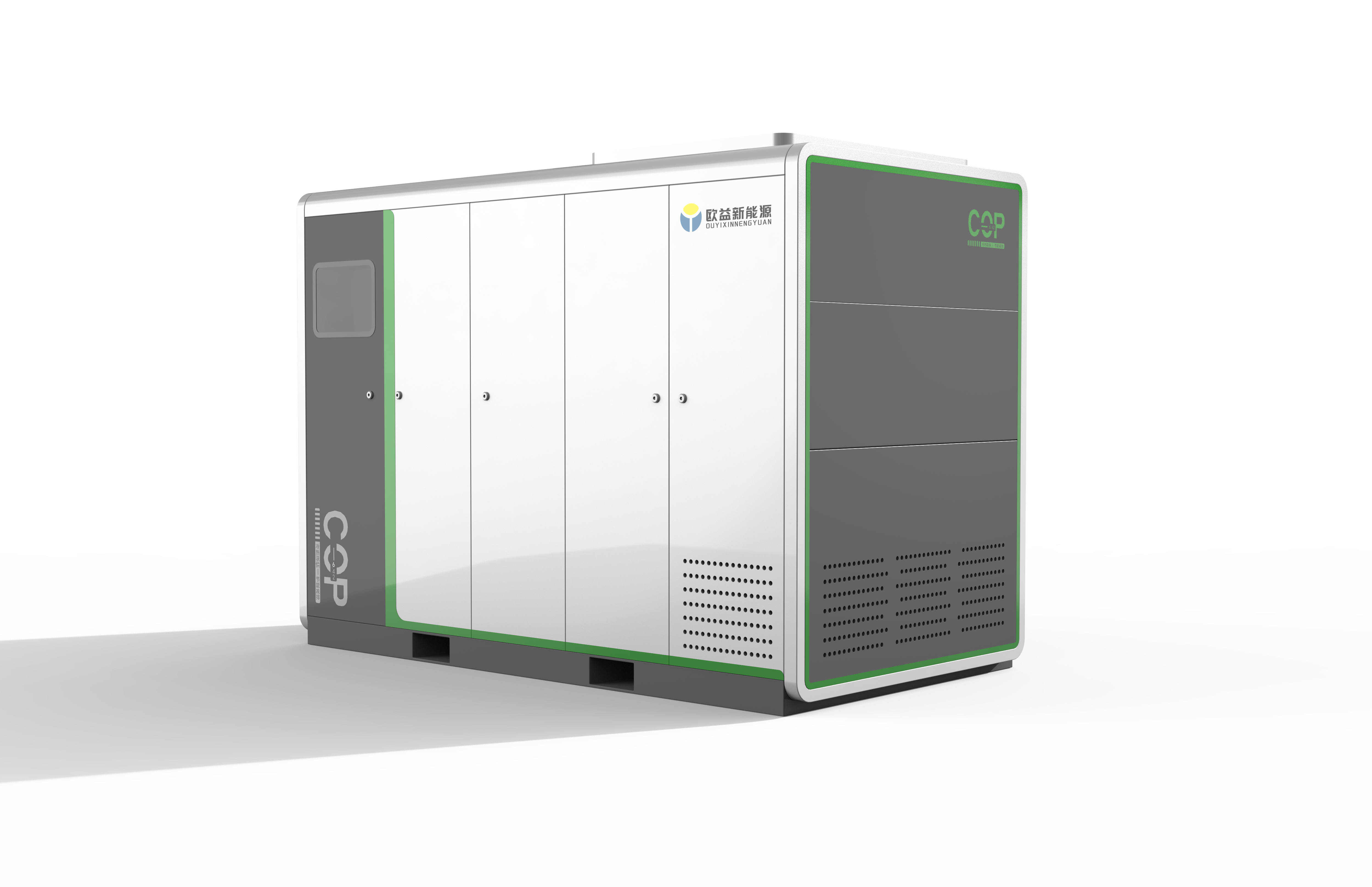
The redesign brings the machine into an upright cabinet. Generous corner radii give the hard metal a sense of temperature, and a two-part vertical division stabilizes the visual weight — the upper zone carries control, the lower carries the door and ventilation. The full-width row of vents at the bottom is a functional necessity, but it is treated as a rhythmic array — the most "industrial" detail of the whole body. Casters tuck into the recessed base, so once the machine lands, all you see is a clean volume.
The second layer of form-making is subtraction: every protruding handle, hinge and service hatch is folded into the panel seams, leaving only one slim vertical pull on the side. From afar it reads as one complete machine; up close, every functional access point is still exactly where it should be.
The control zone is the machine's face. The upper panel becomes a single dark field: a red emergency-stop knob at the center, an array of green indicators in a row — status at a glance.
A cyan light strip runs across the lower edge of the panel — the only "light" on the whole machine. It is not mere decoration: it is on while the machine runs and off while it stands by, translating working state into a visible line of light. Material and finish quality carry the most weight on this panel: the brushed metal, the feel of the buttons, the uniformity of the light strip — all of them speak for the machine.
Craft quality is a key dimension of "near-view quality" in the Shuizhe methodology: material, surface treatment and detail craftsmanship together form the user's intuitive judgment of quality. When the work can be perceived, quality becomes believable.

The centerpiece of this project is a set of three complete CMF directions — one form, three expressions.
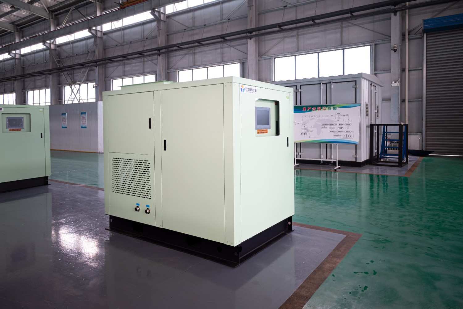
Direction A, lime green × silver: the high-saturation green makes the machine leap out in showrooms and trade fairs — the expression for younger, brand-led positioning. Direction B, white × dark gray: the most neutral reading — clean, dependable, and rarely wrong in food, medical or laboratory settings. Direction C, black × brushed silver: dark door panels over brushed metal, calm and restrained — the expression for commercial and premium spaces.
All three share the same formal and interface language — the panel position, the light strip path, the rhythm of the vent array are identical; only color and material change. This is not three designs, but one design expressed three times: the client can pick an expression to match a market or channel without redesigning the machine.
Brand consistency: product recognition comes from a consistent formal order and interface language. Color is the expression; order is the skeleton — when the skeleton holds, the expressions stand.
Once this steam generator enters mass production, there will be a second and third generation. The three colorways have already prepared the way for a product family: the next generation continues the same formal order and interface language, new functions grow into the old skeleton — recognizable to the market, workable for the factory.
The next time you meet it — in a showroom, a kitchen or a lab — look at that cyan light strip. When it is on, the machine is working; and wherever it is, steam is being made.


A fragmented sludge drying line gains a unified enclosure, a coordinated color system and clearer integration of the conveyor, controls and brand identity.
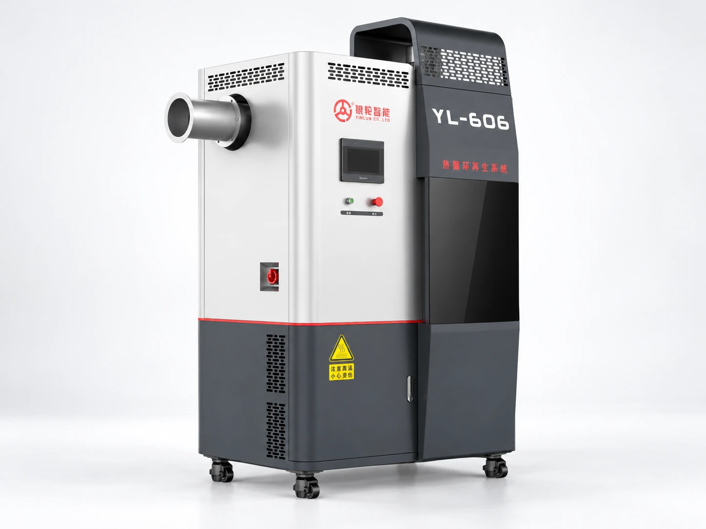
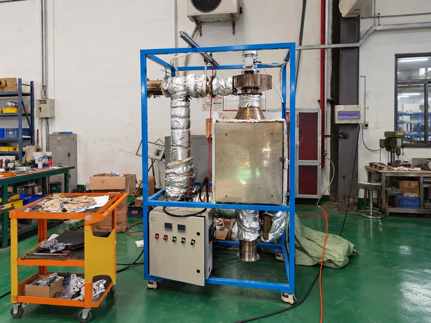
EQPID transformed a thermal circulation regeneration system from an exposed engineering assembly into a more integrated industrial product by reorganizing the enclosure, operating interface, ventilation, visual hierarchy and sheet-metal structure.